What Film Adds to Real Estate and Architecture Images
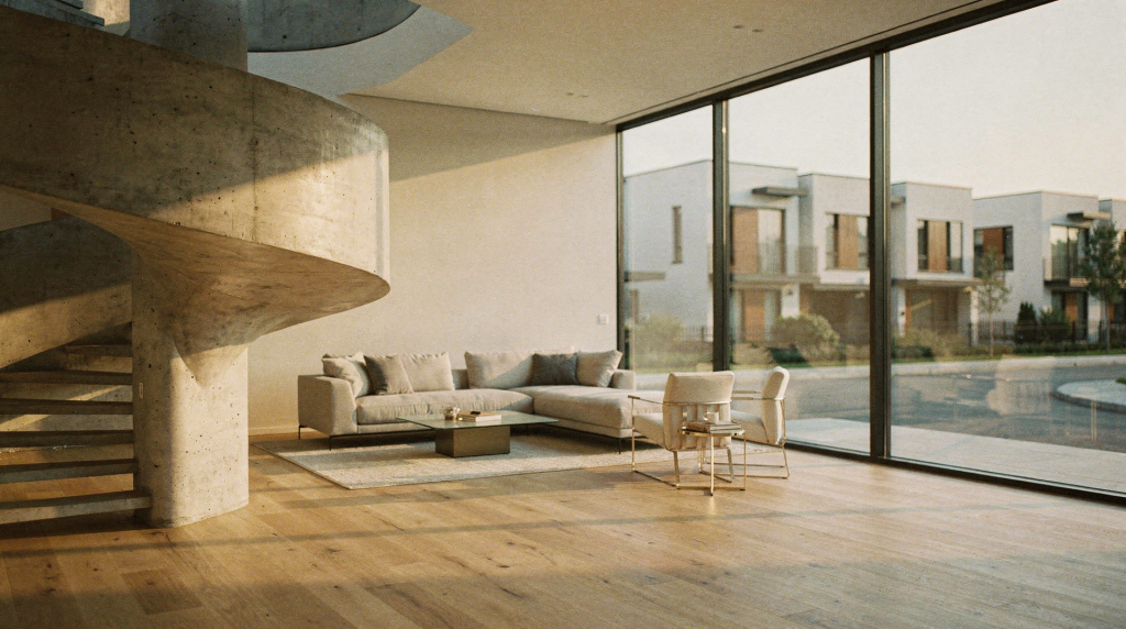
I’ve watched a single frame of 6×7 Portra 400 shift a client’s entire perception of a room — before they noticed the crown molding or the marble counter, they felt the weight of the light. That’s the quiet job film still does in architecture and real estate photography: it changes how a space feels before the viewer analyzes a single detail. In practiced hands, it brings depth, tonal softness, and a sense of time that digital often has to imitate later.
For properties, that matters. Buyers, editors, architects, and design clients are not only looking for documentation — they are responding to mood, material, and atmosphere. Film can make those qualities feel more tangible, more present, more like a place you could walk into rather than a listing you scroll past.
Why Film Still Matters in Built-Environment Photography
The strongest argument for film is not nostalgia. It is interpretation.
Digital excels at precision, speed, and correction. You can check focus on a 5-inch screen, bracket exposures without a second thought, and deliver a gallery before the light outside has changed. Film does something different: it slows the process down and tends to reward careful light reading, deliberate framing, and a stronger relationship with the space itself. When I walk into a room with a handheld meter and a waist-level finder, I’m not just documenting — I’m reading the way daylight pools on worn floorboards, how a shadow cuts across a plaster wall, where the air itself seems to hold texture. That slower rhythm almost always produces images that feel quieter, more dimensional, and more editorial.
Film also has a recognizable visual signature that digital sensors — even with the best profiles — struggle to replicate organically:
- softer highlight roll-off that feels like a gentle exhale rather than a clipped edge
- grain that adds structure and tactility, not the chromatic noise that can creep into digital shadows
- color rendering that leans interpretive rather than clinical — Portra’s gentle warmth, Ektar’s saturated earthiness, the way Fuji stocks handle greens in a sunlit courtyard
- deeper emotional separation between surfaces, shadows, and light, so that a room reads as a sequence of materials rather than a flat, evenly lit box
In homes and buildings, these qualities make plaster, wood, stone, fabric, glass, and patina feel more present. The image stops behaving like a sterile record and starts behaving like a visual experience — one that invites you to linger on the grain of a timber beam or the soft falloff of light across an aged brick wall.
What Film Changes in Real Estate Images
Real estate photography usually aims for clarity, coverage, and speed. Film changes that equation in a few important ways, and understanding them is what separates a thoughtful architectural image from a simple room-for-room catalog.
1. It makes spaces feel more tactile
A well-exposed film frame can emphasize the physical nature of a room: the raised grain of wide-plank floorboards, the matte finish of old limewash paint, the subtle sheen of a brass fixture catching window light, or the softness of daylight as it wraps around a linen curtain. This is especially useful in homes where materiality is part of the selling point — a mid-century modern interior with walnut paneling, a converted warehouse with exposed brick and steel, a farmhouse with hand-plastered walls. Digital can capture these surfaces, but film often renders them with a three-dimensional weight that makes you want to reach out and touch them.
2. It introduces a sense of time
Film is especially good at making a property feel lived-in, not just listed. That is valuable for historic homes, design-led interiors, and architectural properties where heritage is part of the appeal. The image does not just show the room; it suggests its age, atmosphere, and continuity. When I photograph a 19th-century townhouse on medium format, the slight fall-off in the corners, the way the grain interacts with the patina on a door handle — these aren’t flaws, they’re visual cues that place the building in a timeline. The frame feels less like a snapshot and more like a page from an archive that hasn’t been written yet.
3. It reduces the hyper-clean look that can flatten character
Digital photography can make interiors look extremely polished, but sometimes too polished — every surface evenly lit, every vertical corrected to death, every shadow lifted until the room loses its depth. Film often preserves imperfections in a way that feels honest: the slight irregularity of a hand-troweled wall, the unevenness of natural light as it falls across a long hallway, the shadow edge under a cornice that tells you the ceiling height without a wide-angle trick. Those details can make a space feel real instead of overprocessed. They remind the viewer that this is a place with weight and history, not a 3D render.
4. It supports a more selective edit
Because each frame is more intentional — you have 12 or 16 exposures on a roll, not 400 — film usually encourages fewer but stronger images. That can be useful for editorial property coverage, portfolio work, and architect-facing documentation where quality matters more than sheer volume. I’ve walked away from a half-day shoot with only 20 frames and had the client prefer every single one over the 200 they were used to seeing from a digital set. The edit becomes tighter, the narrative clearer, and each image carries more weight.
Film vs Digital for Architecture: What Actually Changes
This isn’t about declaring a winner. It’s about matching the tool to the intention. The table below lays out the practical differences I’ve observed after years of working with both mediums on location.
| Factor | Film | Digital |
|---|---|---|
| Feedback on set | Delayed until development | Immediate review on site |
| Shooting pace | Slower, more deliberate | Faster, more flexible |
| Look | Grain, tonal depth, softer rendering | Crisp detail, high control |
| Highlight handling | Can feel smoother and more forgiving | Very dependent on sensor and exposure |
| Color | Often more interpretive and atmospheric | Often more neutral and correctable |
| Workflow | Shoot, develop, scan, edit | Shoot, import, edit, deliver |
| Best use | Editorial, heritage, mood-led architecture | Listing work, precision, high-volume coverage |
Film is not automatically better. It is better when the assignment benefits from mood, material honesty, and a stronger sense of place. When a client needs 40 clean, evenly lit shots by tomorrow morning, I reach for digital without hesitation. When they want five images that feel like they belong in a monograph, film is often the more eloquent choice.
Where Film Works Best in Real Estate and Architecture
Film is most effective when the property itself has something to say — when the walls hold texture, the light shifts throughout the day, and the materials aren’t trying to hide behind a coat of fresh paint. Here’s where I’ve seen it consistently outperform expectations.
Historic homes
Older homes benefit from the way film can preserve patina, irregularity, and layered detail. The medium often supports the emotional weight of a property instead of smoothing it away. I remember photographing a Georgian townhouse where the original pine floors had two centuries of wear; on digital, the scratches looked like damage, but on Portra 400 they read as history. Film gave the imperfections a voice.
Design-led interiors
Interior designers often want their work to feel calm, intentional, and material-rich. Film is strong here because it handles texture and natural light in a way that feels less commercial and more magazine-like. The way a linen sofa catches side light, the subtle sheen of a matte ceramic vessel, the grain of a custom oak table — these details carry more presence on film, which aligns with the designer’s vision of a space that feels curated rather than staged.
Heritage and landmark documentation
When the goal is not only to show a building but to create an archive, film offers a strong visual continuity. It can make a project feel worthy of long-term reference. I’ve worked on documentation projects where the client specifically requested black-and-white medium format because they wanted the images to sit alongside historical plates from the 1920s. The grain structure and tonal range created a bridge across time that digital couldn’t replicate without obvious filters.
Boutique hospitality and lifestyle properties
Hotels, guest houses, and curated rental spaces often rely on atmosphere. Film helps build that atmosphere quickly, especially in spaces where lighting, material choices, and staging are part of the brand. A boutique hotel room shot on film doesn’t just show you the bed and the view; it suggests the quality of the morning light, the texture of the bathrobe, the quiet luxury of an afternoon spent reading by the window.
When Film Is a Poor Fit
Film is not the answer for every property or every deliverable. I’m always upfront with clients about this, because forcing film into the wrong brief does nobody any favors.
It is usually a weak choice when the brief requires:
- fast turnaround — if the images need to be online by end of day, the development and scanning delay becomes a liability
- large image counts — shooting 80 rooms on film is logistically heavy and expensive
- heavy virtual staging or extensive correction — film doesn’t give you the pixel-level control that complex compositing demands
- strict consistency across many rooms — lighting conditions change, and film stocks can shift subtly from frame to frame, which can frustrate a client who wants every image to match perfectly
- MLS-first listings where coverage matters more than mood — when the goal is simply to show every corner, digital’s speed and flexibility win
It is also less forgiving in situations with mixed lighting, awkward exposure, or last-minute reshoots. If the assignment is commercial documentation rather than visual interpretation, digital is usually more practical. I’ve learned to recognize those briefs early and recommend the right tool accordingly.
How to Use Film Effectively on Architectural Shoots
If the goal is to make film work in property imagery, the process has to be disciplined. Over the years, I’ve settled into a workflow that respects the medium’s strengths and avoids its pitfalls.
Step 1: Read the light before choosing the frame
Walk through the space and identify where the natural light lands, where it falls off, and where shadows add structure. I usually spend a good 15–20 minutes with a handheld meter before I even open the camera bag. Film rewards careful observation more than rapid shooting — the light you notice now will define the frame you make later.
Step 2: Match the stock to the material
Different films behave differently around wood, white walls, concrete, brass, and glass. A warmer stock like Portra 400 may flatter timber and heritage interiors, while a cooler or more neutral stock like Ektar can suit minimal spaces with a lot of daylight. I’ve also used Fuji Pro 400H (when it was available) for its gentle greens and soft contrast in spaces with indoor plants and natural textiles. The choice isn’t just about color — it’s about how the emulsion renders texture and depth.
Step 3: Keep compositions simple
Film handles clutter poorly when the goal is elegance. The strongest architectural frames usually have one clear subject, clean lines, and enough breathing room for the eye to move. I often compose by asking: what is the one thing this room wants me to notice? Then I build the frame around that, letting everything else fall into support.
Step 4: Protect highlights
Bright windows and reflective surfaces can overwhelm a frame. In real spaces, that means paying attention to exposure and accepting that not every part of the room needs equal brightness. I frequently let shadows go deep to preserve the detail in a sunlit curtain or the view outside a window. That sacrifice creates atmosphere; it tells the viewer where the light is coming from and how it shapes the room.
Step 5: Edit with restraint
The mistake most people make after scanning film is overcorrecting it. If the point is to preserve the medium’s character, keep contrast, grain, and color adjustments controlled. I ask my lab for flat scans and then do minimal tweaks — usually just a gentle curve adjustment and a touch of clarity. The moment you try to make film look like digital, you lose the very thing you chose it for.
Choosing Film Stocks for Built Environments
The best stock depends on the project, but some general patterns have held up across hundreds of rolls. Think of the table below as a starting point, not a rulebook — every space has its own light and its own story.
| Film type | Best for | Strengths | Trade-offs |
|---|---|---|---|
| Fine-grain color negative | Editorial interiors, polished residential work | Smooth tonality, flexible scanning | Can feel understated if the light is flat |
| Warm color negative | Heritage homes, wood-heavy spaces | Richer tones, inviting mood | Can skew too warm in yellow light |
| Black-and-white film | Historic architecture, detail studies, moody interiors | Strong texture and structure | Less useful when color is central to the design |
| Medium format film | High-end interiors and architectural portfolios | Detail, tonal depth, elegant rendering | Slower workflow and fewer frames |
For most serious architectural work, medium format is the sweet spot. It gives enough detail for large reproductions while preserving the texture and tonal nuance that make film attractive in the first place. My personal go-to is a 6×7 back loaded with Portra 400 — it handles mixed interior light gracefully and holds highlights with a gentleness that flatters almost any material.
Common Mistakes to Avoid
Film can make a property look beautiful, but only if the approach is controlled. I’ve made most of these mistakes myself, and I see them repeated often enough that they’re worth naming.
- Shooting as if film is a shortcut to “artistic” images — it’s not. A poorly composed frame on Portra is still a poorly composed frame; the stock adds character, not magic.
- Ignoring practical exposure challenges in mixed-light interiors — tungsten overheads mixing with daylight can create color casts that are hard to correct. Sometimes the answer is black-and-white, or a color-correcting filter, or simply waiting for the light to change.
- Choosing a stock for mood without considering the room’s materials — a warm stock in a room with yellow walls and warm wood can turn muddy fast. Test a roll first if you’re unsure.
- Over-relying on scanning and post-production to fix poor framing — if the composition doesn’t work on the light table, no amount of cropping will save it.
- Forcing film into a brief that needs speed and volume instead of atmosphere — be honest with yourself and the client. Film is a tool, not a religion.
- Using grain as decoration instead of letting it support the image — grain should feel like part of the photograph’s texture, not an effect layered on top. Overexposing slightly and developing normally often yields grain that integrates beautifully rather than shouting for attention.
A good film architectural image is not vague or dreamy by default. It is precise, calm, and visually disciplined — every element in the frame has a reason to be there.
Checklist for a Successful Film Architecture Shoot
Over time, I’ve distilled my on-location routine into a mental checklist. It keeps me from getting seduced by the light and forgetting the practicalities.
- Confirm the client wants mood, character, and texture, not only documentation — align expectations before you load a single roll.
- Scout the building at the time of day the shoot will happen — I often visit the day before with a meter and a notebook, recording light levels in each room.
- Note window direction, reflected light, and problem areas — a north-facing room at 2 p.m. behaves very differently from a south-facing one.
- Choose film stock based on material palette and lighting conditions — bring at least two options in case the light shifts unexpectedly.
- Bring enough film for deliberate reshoots, not endless experimentation — I typically pack twice as many rolls as I think I’ll need, so I can redo a frame with a different exposure or composition without anxiety.
- Meter carefully and avoid underexposing shadows too aggressively — film handles overexposure better than underexposure; when in doubt, give it a little more light.
- Shoot both wide compositions and detail frames — the wide shot sets the context, the detail shot tells the story of the materials.
- Keep a written log of frame numbers, exposures, and location notes — this is invaluable when you’re reviewing scans and trying to remember why you made a particular choice.
- Request scanning specs that match the final use case — if the images are for print, ask for higher resolution and a flat profile; for web, a well-exposed 2000px scan is often enough.
- Review scans before making assumptions about color or contrast — what looks flat on a raw scan may only need a gentle curve to come alive.
How Film Changes the Viewer’s Perception
This is the part many property teams underestimate.
Film can shift the emotional reading of an image in subtle but profound ways. A digital frame may say, “This is the room.” A film frame may say, “This is the room, and this is how it feels to stand here.” The difference lives in the grain, the highlight roll-off, the slight imperfections that signal a human process behind the image.
That difference matters in architecture because buildings are not just objects. They are environments shaped by light, use, and memory. Film gives those qualities a stronger visual voice — it translates the weight of a space into something you can almost feel through the screen or the page. For real estate, that can help a property feel more distinctive, more memorable, more like a home than a house. For architecture, it can help an image read less like marketing and more like a document with personality — a record that respects the building’s character instead of smoothing it into generic perfection.
FAQ
Is film better than digital for real estate photography?
Not always. Film is better when mood, texture, and atmosphere matter more than speed and volume. I use it for editorial features, architect portfolios, and properties where the story is in the materials. Digital is usually better for listing coverage and fast turnaround — when an agent needs 40 clean, consistent images by tomorrow, I don’t hesitate to go digital.
Why do film architectural images feel more “alive”?
Because film often renders light, grain, and material texture in a way that feels less clinical. It preserves small irregularities — the slight wave in a handblown glass pane, the uneven fade of a rug in sunlight — that make a space feel tangible and inhabited. Digital can capture these things, but film tends to give them more visual weight without extra processing.
Can film work for modern minimalist interiors?
Yes, but it has to be used carefully. Clean compositions, controlled highlights, and the right stock are essential so the image does not lose the clarity that minimalist spaces need. I often reach for a fine-grain color negative like Ektar or a neutral black-and-white stock, and I meter precisely to keep whites clean and shadows crisp.
Is medium format worth it for interior photography?
Often, yes. Medium format offers strong detail and tonal depth, which are valuable for architectural work where materials and surfaces matter. The larger negative gives you smoother gradations and a sense of dimensionality that’s hard to achieve with 35mm. The trade-off is a slower workflow and fewer frames per roll, but for high-end projects, the results justify the pace.
What kind of properties benefit most from film?
Historic homes, designer interiors, heritage buildings, boutique hospitality spaces, and any property where character is part of the value. If the walls have a story, film will usually tell it better.
Conclusion
Film adds more than a look to real estate and architecture images. It adds interpretation, texture, and a sense of time that can make a property feel more human and more memorable. Used well, it does not replace digital; it complements it by giving built spaces a visual language that feels slower, richer, and more narrative-driven.
For photographers and clients who want architecture to be felt as well as seen, film remains a powerful tool — one that rewards patience, observation, and a genuine connection to the spaces we document.