How Photographs Shape the Identity of a Property
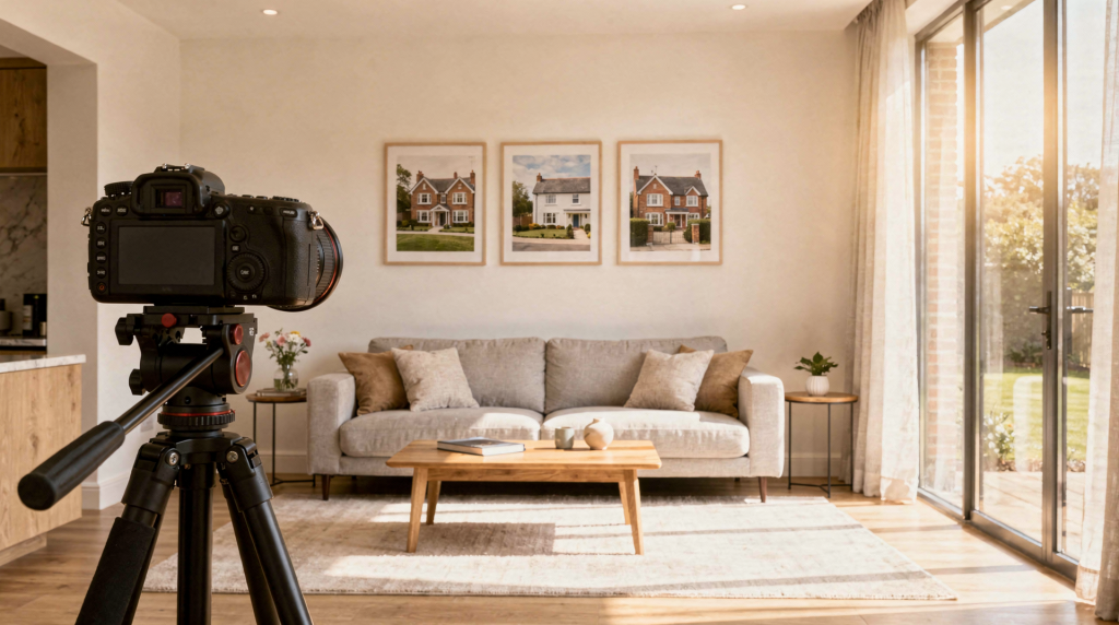
A property is never seen twice in exactly the same way—light shifts, seasons turn, and every visitor brings their own lens. But a photograph can fix one version of a space so firmly that it becomes the version people remember. When that photograph is made on film, the fixed version carries something extra: the weight of grain, the soft fall of natural light across worn floorboards, a sense that the space was felt, not just captured. The right image doesn’t simply show rooms and finishes; it frames value, atmosphere, status, and memory, shaping how people understand the property long before they ever step inside.
For buyers, sellers, agents, and owners, this matters because most first impressions now happen online. Bright, carefully composed images can make a home feel spacious, welcoming, and credible, while weak or careless photography can make even a strong property seem flat or neglected. And in an era of endless scrolling, the difference between a listing that stops someone and one that’s passed over often comes down to a single frame.
Why property identity starts with images
A property’s identity is the sum of what people believe it is: elegant, practical, historic, contemporary, premium, modest, warm, or functional. Photography sets that identity faster than any description because images communicate emotion and meaning before the viewer processes facts. I’ve watched this happen on location countless times—the moment I frame a shot, I’m already deciding what story the building will tell. A wide angle on a sunlit kitchen suggests generosity; a tight detail of original plaster moulding whispers age and care.
In real estate and architectural contexts, this isn’t just a visual issue. It affects attention, trust, and perceived value, and it can determine whether people engage with a listing at all. Film, with its organic rendering of light and texture, often deepens that initial connection because it avoids the sterile perfection that can make digital images feel interchangeable.
What photographs actually communicate
Photographs shape identity through a handful of specific signals, each of which film interprets in its own way:
- Light: Natural light suggests honesty, calm, and livability. On film, window light doesn’t just illuminate—it wraps around surfaces, creating a gentle fall-off that digital sensors sometimes miss. I’ll often wait for the hour when light rakes across a room’s floorboards, and a stock like Portra 400 will hold both the highlight on the wood and the shadow in the corner without losing the mood.
- Composition: Straight lines, balanced framing, and thoughtful angles suggest care and order. With a medium-format camera, the larger negative forces a slower, more deliberate approach—every vertical is checked, every edge considered. That discipline reads as intentionality in the final image.
- Texture: Grain, shadows, plaster, stone, wood, and worn surfaces create a sense of age and authenticity. Film grain isn’t noise; it’s a physical structure that gives materials tactility. When I photograph a weathered brick wall on Tri-X, the grain becomes part of the wall’s story, not a distraction from it.
- Scale: Wide views can make a property feel expansive, while tighter frames emphasize intimacy or craftsmanship. A 35mm lens on a film body can pull a whole room into a frame that feels immersive rather than merely wide.
- Context: Surroundings, neighborhood cues, and exterior details tell the viewer where the property sits culturally and geographically. A single frame that includes a sliver of the street, the quality of light on the façade, and the texture of the front door can anchor a building in its place more effectively than a dozen generic exterior shots.
A photograph does not simply record a space. It edits the viewer’s expectations of that space, and every choice—film stock, lens, time of day—steers that edit.
The difference between documentation and identity-building
Not every property photo does the same job. Some images exist to document condition; others are meant to build a narrative. The distinction matters because a property can be presented as a commodity or as a place with character. The image style determines which reading wins.
| Type of image | Main purpose | Identity effect |
|---|---|---|
| Basic listing photo | Show layout and features | Functional, informational |
| Editorial property photo | Tell a story about place | Distinctive, atmospheric |
| Branding image | Support an agent or developer’s visual identity | Consistent, polished, recognizable |
| Architectural image | Present the building as designed work | Intentional, design-led, timeless |
In my own work, I lean toward the editorial and architectural ends of this spectrum. Film naturally pulls an image away from pure documentation because it introduces a handcrafted quality—a slight imperfection in the frame edge, a tonal curve that feels remembered rather than clinical. That’s not a flaw; it’s the mechanism by which a space becomes a place.
How photography changes perceived value
Good photography rarely changes the physical property, but it can change how valuable it feels. Polished images tend to signal seriousness, quality, and legitimacy, which makes the asking price feel more justified. When a room is photographed on film with careful attention to natural light and accurate color, the resulting image carries a quiet authority: it says this space has been considered, not just snapped.
That happens for a simple reason: people assume that what looks well-presented has been well cared for. Clean light, accurate color, and controlled composition imply maintenance, attention, and professionalism. I’ve seen how a single roll of Ektar, shot in the right morning light, can make a modest living room feel like a considered retreat—not by distorting reality, but by revealing the best version of what’s already there.
Poor photography creates the opposite effect:
- Rooms look smaller than they are.
- Surfaces appear dirtier or older.
- Architectural details disappear into murky shadows.
- Buyers assume the listing is less desirable or overpriced.
The difference isn’t about expensive gear; it’s about understanding how light, composition, and medium work together to shape perception. Film, with its limited dynamic range and need for deliberate exposure, forces that understanding in a way that automatic digital modes often bypass.
The visual identity of different property types
Different kinds of properties need different photographic strategies because they carry different identity goals. The film stock, lens choice, and even the development process can be tuned to match the building’s character.
Historic homes
Historic properties benefit from images that respect material texture, patina, and proportion. The goal is not to make the building look new, but to make age feel intentional and valuable. I often reach for a lower-contrast black-and-white film like Ilford FP4+ or a color negative stock with a gentle palette—Portra 160, for instance—to let plaster cracks, worn stair treads, and original hardware speak without shouting. Grain becomes a collaborator, not an enemy.
Luxury properties
Luxury listings rely on consistency, symmetry, and atmosphere. The photography should feel controlled and refined, with every frame supporting exclusivity and confidence. Here, I might use a fine-grain color film like Ektar 100 or a medium-format slide film for its precise color rendition and almost three-dimensional depth. The larger negative holds detail in highlights and shadows that reinforces the sense of quality—marble veining reads clearly, silk curtains retain their sheen without blowing out.
Family homes
For everyday homes, the images should emphasize comfort, function, and livability. The best photographs make it easy to imagine daily routines in the space. A 35mm camera loaded with Portra 400 lets me move quickly, catch natural light as it shifts through a kitchen, and preserve the warmth of lived-in textures. The slight grain and soft color palette feel approachable, never sterile.
Architecture-led spaces
Design-oriented spaces need photographs that show structure, light, and form. Here, the property’s identity is tied closely to how clearly the photographs reveal design intent. I’ll often use a sharp, low-speed slide film or a fine-grained black-and-white stock like T-Max 100, paired with a tripod and careful perspective control. The goal is to let the architecture speak with clarity—straight lines stay straight, and the interplay of volumes and light becomes the subject.
Why film photography changes the conversation
Film adds another layer to property identity because it handles light and texture differently from digital capture. Grain, tonal depth, and subtle imperfection can make a building feel more tactile and more human. When I load a roll of Tri-X and photograph a 19th-century townhouse, the resulting images don’t just document the space—they seem to hold the weight of its history. The grain structure embeds itself in the image like a patina, and the way film renders highlights (with a gradual roll-off rather than abrupt clipping) gives windows and light fixtures a luminous, almost breathing quality.
That doesn’t mean film is better in every case. It means film is especially useful when the goal is to communicate atmosphere, heritage, and material presence rather than pure listing efficiency. In architectural and interior work, film can make a space feel remembered instead of merely recorded. A digital file might show you what a room looks like; a well-exposed negative can suggest what it felt like to stand in that room as the afternoon light faded.
There’s also a practical edge: film’s slower, more intentional workflow means I spend more time observing a space before I release the shutter. That observation translates into images that are more considered—fewer frames, but each one carrying more weight.
Common mistakes that weaken a property’s identity
- Shooting too wide, which makes the space feel distorted rather than generous. A 24mm lens on a digital body can turn a cozy living room into a funhouse; on film, I’m more likely to use a 35mm or 50mm and step back, preserving natural proportions.
- Using harsh flash or flat lighting, which removes mood and texture. On-camera flash kills the very shadows that give a room depth; film’s sensitivity to available light encourages finding the right natural light instead.
- Overediting, which creates distrust because the space no longer feels real. Heavy HDR or saturation pushes an image into uncanny territory. With film, the edit is baked into the stock and development choices—less temptation to overprocess.
- Ignoring context, which strips the property of neighborhood and historical meaning. A few frames that show the street, the front garden, or the building’s relationship to its surroundings anchor the property in a real place.
- Mixing inconsistent styles across a listing, which weakens visual coherence. A set of images should feel like they came from the same eye, the same light, the same story.
The biggest mistake is treating photography as a neutral service. In practice, every image pushes the property toward a specific identity. Even the choice between a digital file and a film scan is a decision about what kind of authenticity you want to project.
A practical framework for choosing the right photographic approach
Use this quick checklist before a shoot or image selection:
- Define the property’s core identity in one sentence. Is it a light-filled family retreat, a meticulously preserved historic gem, a minimalist architectural statement?
- Decide whether the goal is sale, branding, archival value, or editorial storytelling. The answer changes the film stock, the lens, and the edit.
- Identify the most important visual cues: light, material, scale, history, or lifestyle. Let those guide where you stand and when you press the shutter.
- Choose a composition style that supports that goal. Symmetry for formality, asymmetry for energy, tight details for texture.
- Review whether each image reinforces the same message. If one frame screams “cozy cottage” and the next whispers “urban loft,” the identity fractures.
- Remove any frame that introduces confusion or visual noise. A single weak image can dilute the whole set.
If the images do not say the same thing about the property, the identity becomes fragmented. I’ve learned to be ruthless in editing contact sheets—better ten frames that sing one clear note than thirty that hum different tunes.
Step-by-step: how to build a stronger property identity through photos
- Start with the story
Decide what the property should feel like: historic, modern, calm, dramatic, practical, or rare. This decision will guide every technical choice, from film stock to development time. - Control the light
Schedule the shoot for the time of day when the property looks most natural and dimensional. I often scout a location twice—once to see how light moves through the rooms, then again to shoot when it’s at its best. Film rewards this patience. - Prioritize defining details
Capture elements that reveal character: staircases, window light, original trim, materials, and transitions between rooms. On film, a close-up of worn brass hardware or a plaster wall catching side light can carry as much narrative weight as a wide establishing shot. - Keep perspective honest
Straight verticals and believable proportions maintain trust and preserve architectural integrity. A tripod and a spirit level are non-negotiable for architecture-led work; even handheld, I’m constantly checking edges in the viewfinder. - Edit consistently
Use one visual language across the set so the property feels coherent, not assembled from unrelated moments. If I’m shooting a whole house on Portra 400, I’ll process and scan the entire batch together to keep the color palette unified.
When photographs become part of memory
Photographs shape identity not only because they help people decide, but because they help people remember. A property seen through strong imagery can become the version people talk about, revisit, and emotionally attach to. This is especially true for homes with history. Images can preserve a sense of continuity, allowing the property to live as both place and narrative.
Film deepens this memorial quality. A negative is a physical object—a sliver of acetate that holds the latent image of a specific moment of light. Years later, that negative can be reprinted, rescanned, reinterpreted. The property doesn’t just exist in the photograph; it exists in the archive. In that sense, photography is not only marketing. It is interpretation, and sometimes, it’s the closest thing we have to a building’s memory.
Conclusion
Photographs shape a property’s identity by controlling first impressions, signaling quality, and turning physical space into a readable story. The strongest property images do not simply show what exists; they define how the property should be understood, remembered, and valued. Whether the medium is digital or film, the principle holds—but film, with its deliberate pace and textural honesty, offers a unique path to creating images that feel less like documentation and more like a conversation with the building itself.
FAQ
Do photos really affect how valuable a property feels?
Yes. High-quality photography can make a property seem more polished, trustworthy, and worth the asking price. When images are carefully composed and lit—especially when they carry the tonal depth and natural color of film—they signal that the property has been treated with care and attention.
Is architectural photography the same as real estate photography?
No. Real estate photography usually aims to market a property quickly, often prioritizing wide, bright, and informational shots. Architectural photography focuses more on design intent, form, and atmosphere, and it often benefits from the slower, more interpretive approach that film encourages.
Why does natural light matter so much?
Natural light makes spaces feel clearer, softer, and more believable, which helps viewers trust what they are seeing. Film’s response to natural light—its gentle highlight roll-off and subtle color shifts—enhances this trust because it avoids the harsh, artificial look that flash or overprocessed digital files can produce.
Can film photography help a property stand out?
Yes. Film can add texture, tonal depth, and a stronger sense of atmosphere, especially for historic or design-led properties. In a sea of digitally uniform listings, a set of film images can feel more intentional and memorable, giving the property a distinct visual voice.
What is the biggest mistake in property photography?
The biggest mistake is inconsistency: when the images do not support one clear identity, the property feels less defined and less memorable. Mixing harsh flash with soft natural light, or combining heavily edited frames with untouched ones, fractures the story and weakens the viewer’s emotional connection.