Photographing a House as a Sense of Place
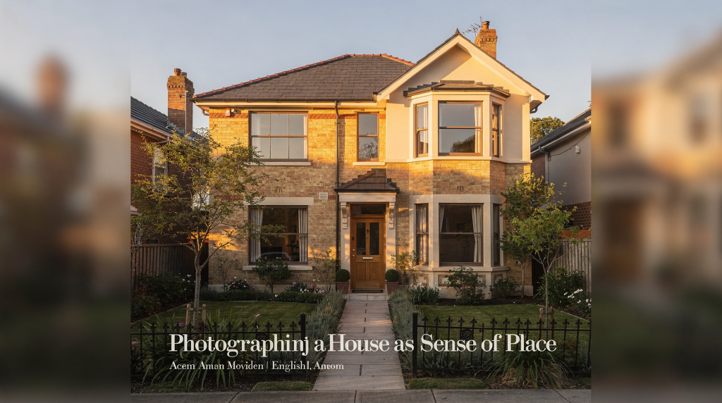
A house is never just walls, windows, and furniture. When photographed well, it becomes a record of light, routine, age, and atmosphere — the things that make a property feel lived in rather than merely seen. Film is especially suited to this task because it turns texture, contrast, and tonal softness into part of the story.
Why “sense of place” matters in house photography
Most property photography stops at description: this is the kitchen, this is the facade, this is the staircase. That approach documents layout, but it does not explain why a home feels calm, formal, weathered, warm, or still in time.
A sense of place goes further. It asks the photographer to show:
- how the light moves through the rooms
- how materials age and catch shadow
- how architecture relates to the surrounding landscape or street
- how a house reflects the people, history, and climate that shaped it
For architectural work on film, that perspective is not a stylistic extra. It is the point. I’ve walked through enough properties to know that the difference between a competent real estate shot and an image that holds your gaze comes down to whether the photographer was paying attention to the house itself or just ticking rooms off a list. Film forces that attention — you have fewer frames, each one costs something, and the process slows you down enough to notice things.
What film adds to architectural and interior photography
Film changes the way a house is translated into an image. Grain softens perfection. Tone transitions feel less clinical. Highlights bloom differently than they do on a digital sensor. In interiors, that matters because real homes rarely offer even, controlled lighting. I’ve shot enough 35mm and medium format indoors to know that the unpredictability of available light is not a flaw to correct — it’s the authentic character of the space.
Film is useful here because it can:
- render natural light with a more restrained, atmospheric quality
- preserve texture in plaster, timber, stone, and painted surfaces
- make mixed lighting feel less sterile when managed carefully
- encourage slower, more intentional framing
It is not that film is automatically better than digital. When I need to deliver fifty clean listing photos by tomorrow, I understand why digital dominates. But when the goal is mood, materiality, and memory rather than technical completeness, there’s no comparison. Film interprets a room; digital, by default, catalogs it. That difference shows up in the grain structure softening the edges of a sunlit windowsill, in the way a color negative stock handles the green cast from garden light bouncing into a room — these are not imperfections; they are the language the medium speaks.
The core idea: photograph the light, not just the room
A room becomes memorable when the light explains it. I’ve stood in countless empty spaces that felt unremarkable until the sun shifted, and suddenly the texture of a plaster wall or the patina on old floorboards became the whole story. That is not luck — it’s learning to watch how light behaves in a given room before you ever raise the camera.
Look for:
- side light that brings out texture in walls, brick, or wood
- window light that creates a clear contrast between interior and exterior
- morning or late afternoon sun for gentler angles
- overcast conditions when you need soft, even illumination
For interiors, natural light usually gives the strongest sense of place because it shows the room as it exists in everyday life. Hard flash can flatten that character unless the assignment specifically needs a more commercial or corrected look. I rarely carry flash for architectural film work — if a room is too dark to read on film, I’d rather return at a different time of day than introduce a light source that erases the very atmosphere I’m trying to preserve.
Quick rule
If the light is describing the architecture, keep it. If the light is competing with the architecture, simplify it. That might mean waiting twenty minutes, opening a curtain further, or closing a door to eliminate a harsh shaft of midday sun that’s bleaching out half your frame.
Choosing film stock for houses and interiors
Film stock affects how the property feels in the final frame. For houses, the best choice depends on the room’s brightness, the materials present, and whether you want neutrality or mood. I’ve loaded the wrong stock before — 50 ISO on an overcast day in a dark timber-lined library — and the lesson sticks: the film has to match the light you have, not the light you wish you had.
| Film type | Best for | What it tends to do well |
|---|---|---|
| ISO 160 color negative | Bright interiors, soft daylight rooms | Clean tones, gentle color, subtle highlights |
| ISO 400 color negative | Mixed light, general architectural work | Versatility, easier exposure latitude, dependable results |
| ISO 800 color negative | Dim interiors, low-light rooms, faster working pace | More flexibility in darker spaces, stronger grain |
| Black-and-white film | Texture-focused spaces, historic interiors, minimalist architecture | Strong separation of form, material, and shadow |
If the house has large windows and plenty of daylight, a slower stock can look elegant and controlled — Portra 160, for instance, handles white-painted rooms beautifully, keeping the highlights from blowing out while retaining enough shadow detail to let the space breathe. If the interiors are darker or the project moves quickly, ISO 400 is usually the safest all-round choice; it has the latitude to absorb exposure mistakes and still hold together. I’ve done entire shoots on HP5 at 400 in overcast conditions and walked away with frames that felt honest to the gray light outside.
Practical stock selection by material
- Pale plaster and white-painted rooms: use a stock with gentle highlight handling — overexposing a stop on Portra 400 often yields a luminous quality that digital would render flatly.
- Timber-heavy interiors: use a stock that preserves warm midtones without over-saturating; I lean toward stocks with a restrained color palette so the wood grain, not the color cast, carries the frame.
- Stone or brick: choose a film with enough contrast to keep surface detail visible — too flat a stock and the texture disappears into uniform gray.
- Mixed modern interiors with glass and metal: use a stock that handles highlights without harsh clipping, because specular reflections off glass can spike brightness unpredictably.
How to approach a house shoot step by step
1. Walk the property before unloading the camera
Start by observing the direction of light, the strongest views, and the rooms that explain the house best. Do not begin with the most obvious shot. Begin with the shot that defines the atmosphere. I usually spend ten to fifteen minutes just walking through a property in silence, noting where the light pools on the floor, which windows throw the most interesting shadows, and how the sequence of rooms feels as I move through them.
Ask:
- Which room tells the story of the house?
- Where does the light become most expressive?
- What details feel specific to this property and nowhere else?
2. Build a shot list around the house’s character
A useful set usually includes:
- a contextual exterior
- a threshold image, such as a hallway or entrance
- one or two principal rooms
- details of material, joinery, or wear
- a frame that includes the relationship to garden, street, or landscape
This keeps the work from becoming repetitive. It also helps the final selection feel narrative rather than generic — a visual walkthrough that respects the actual experience of being in the house.
3. Use a tripod
For architectural film work, a tripod is not optional. It gives you:
- precise composition
- slower, more deliberate framing
- the ability to work at smaller apertures
- control over long exposures in low light
Interior work often requires exposures from fractions of a second to several seconds. Without a tripod, you will lose sharpness or be forced into compromises that flatten the result. I’ve tried hand-holding medium format in a dim hallway once — the frames were unusable. A sturdy tripod and a cable release are non-negotiable for the kind of slow, precise work that interior film photography demands.
4. Meter for the room, not the window
One of the most common mistakes in house photography is exposing for the brightest view and letting the room fall into darkness. That usually produces a technically neat window and a dead interior. I see this constantly in amateur work — a perfectly exposed sky outside and a room reduced to impenetrable shadow, as if the photographer forgot what the subject actually was.
Instead:
- meter the midtones in the room
- check the brightest areas separately
- decide whether the window can be brightened or should remain softly blown
- bracket if the contrast is high
A slightly bright window is often acceptable. A room with no readable detail usually is not. Film’s latitude helps here — a bit of overexposure in the windows often scans back with a gentle glow that feels natural rather than technical failure.
5. Keep the composition calm
House photography works best when the frame feels settled. That means:
- vertical lines should stay vertical
- furniture should not block the architecture
- objects should support the room, not clutter it
- perspective should feel natural, not forced
If you need to correct too much in post, the composition was probably too hurried on location. I often find myself adjusting the tripod height by inches and shifting the camera position laterally by half a step — small movements that dramatically change how the space reads.
A practical exposure checklist for interiors
- Set the camera on a tripod
- Choose an aperture around f/8 to f/11 for architectural depth
- Focus carefully, especially in smaller rooms
- Meter the midtone area of the room
- Check the brightest window zone
- Take a second frame if the contrast is high
- Keep notes on exposure decisions for future shoots
This process becomes faster with experience, but the principle stays the same: protect the atmosphere without losing structure. I keep a small notebook in my bag specifically for exposure notes — it’s saved me on reshoots more than once.
Natural light challenges and how to handle them
Mixed daylight and artificial light
Many houses contain daylight, tungsten bulbs, and sometimes daylight-balanced LED lighting all in one frame. That can create color shifts that feel messy on film. Some stocks handle mixed color temperatures more gracefully than others, but the best approach is often to simplify the light sources before you start.
Ways to handle it:
- turn off unnecessary artificial lights
- open curtains fully to strengthen natural light
- shoot at a time of day when daylight dominates
- accept a small color cast only if it suits the mood
Very contrasty rooms
Rooms with bright windows and dark corners often need compromise. I’ve shot in old farmhouses where the only light source was a single south-facing window, and the far corner of the room was practically night. Film handles this differently than digital — highlights blow out more gracefully, but underexposed shadows on negative film can get muddy fast.
Options:
- expose for the room and let the windows sit brighter
- make a bracketed sequence
- return at a different time of day when the light is softer
- use black-and-white film if the color contrast is distracting
Low-light interiors
In dim houses, slower film can struggle unless you accept long exposures or stronger grain. Some of my favorite interior shots have been on pushed HP5 in rooms that barely had enough light to read by — the grain became part of the mood rather than a compromise.
Your options are:
- use ISO 400 or ISO 800 film
- open the aperture if depth of field allows
- extend exposure time on a tripod
- work with rooms that still have some natural light rather than forcing every space
Common mistakes when photographing a house
- shooting only the widest possible angle
- ignoring transitional spaces such as halls, landings, and thresholds
- overcorrecting color until the room loses its character
- placing the camera too low or too high without reason
- flattening the image with front-on, uninspired framing
- treating every room as equally important
A strong house story needs hierarchy. Not every room deserves equal visual weight. I learned this the hard way after delivering shoots where every frame competed for attention. Now I think like an editor: which room anchors the narrative, and which details support it?
How to make the home feel lived in without cluttering the image
A place feels real when it contains traces of use, but those traces must be edited with care. The difference between authentic atmosphere and forced styling is something film picks up on immediately — the grain renders intention as clearly as it renders texture.
Useful details include:
- a chair pulled slightly from the table
- folded linen
- books, ceramics, or tools that belong to the house
- worn flooring, patina, chipped paint, or sun-faded fabric
Avoid:
- excessive styling
- visible distractions
- random objects with no relationship to the architecture
- anything that turns the image into a set rather than a home
The goal is presence, not staging. I’ve often found that the best detail shots are the ones I didn’t arrange at all — a windowsill with peeling paint and a dead moth, a stack of mail on a worn wooden table. Those are the things that tell you someone lives here.
Film vs digital for property storytelling
| Aspect | Film | Digital |
|---|---|---|
| Texture | Adds visible grain and softer transitions | Cleaner, sharper, more controlled |
| Color | Often more nuanced and interpretive | Easier to standardize and correct |
| Pace | Slower, more deliberate | Faster, more flexible |
| Feel | Strong for memory, mood, and heritage | Strong for precision and volume |
| Best use | Editorial, archival, atmospheric projects | Listings, documentation, high-volume delivery |
For commercial property documentation, digital often wins on speed and consistency. For editorial work, heritage narratives, and image-making rooted in atmosphere, film often communicates more convincingly. I’ve shot both, and the distinction becomes clearest when you look at the images side by side: digital shows you what a house looks like; film shows you what it felt like to be there.
A simple workflow for photographing a house on film
- Study the property and light before shooting
- Identify the rooms that define the house
- Choose a film stock suited to the brightness and materials
- Use a tripod and meter carefully
- Prioritize natural light and clean compositions
- Bracket when contrast is difficult
- Edit selections with restraint
- Sequence the final images to tell a visual story
That sequencing matters. A house should unfold like a walk through memory: exterior, threshold, room, detail, atmosphere. When I lay out contact sheets after a shoot, I’m thinking about how the images move from one to the next, whether the narrative breathes or rushes.
When film is the right choice
Film is especially effective when the project involves:
- historic homes
- interiors with strong natural light
- properties where texture matters more than perfect technical neutrality
- editorial features about architecture, heritage, or design
- personal or artistic documentation of a home
If the assignment demands total efficiency, extensive retouching, or rapid delivery, digital may be the better operational tool. If the goal is to make a property feel rooted in time and place, film earns its place immediately. I’ve done enough projects on both formats to know that choosing film is not about rejecting digital — it’s about matching the medium to the message.
Final checklist before you leave the house
- Did you capture the exterior in relation to its surroundings?
- Did the light describe the architecture?
- Are the main rooms readable and calm?
- Did you include at least one detail with texture or age?
- Do the frames feel like this house and not just any house?
If the answer to all five is yes, the shoot likely carries a sense of place rather than a simple record of rooms. I run through this checklist before I pack up my gear, every time. It’s the difference between hoping I got the shot and knowing I did.
FAQ
What is the best film stock for photographing a house?
ISO 400 color negative film is usually the most practical starting point because it handles mixed light and typical interiors well. I often recommend Portra 400 for its forgiving latitude and gentle color palette — it’s hard to go wrong with it in unpredictable lighting.
Should windows be exposed perfectly in interior photography?
Not always. In house photography, it is often better to preserve the feeling of the room and allow the windows to run slightly bright. A softly blown window reads as atmospheric; a perfectly exposed exterior with a black interior reads as a mistake.
Is black-and-white film good for architecture?
Yes. It is especially strong when you want to emphasize form, texture, shadow, and historic character. Stripping away color often reveals structure more clearly, and the grain structure of black-and-white stocks like Tri-X or HP5 can add a timelessness that suits older buildings.
Do I need a tripod for interior film photography?
Yes. A tripod gives you the control needed for small apertures, low light, and careful composition. Hand-holding might work for quick snapshots, but for architectural work where vertical lines must stay vertical and exposures often run into seconds, a tripod is essential.
How do I make a house feel emotional in photographs?
Focus on natural light, materials, transitions between rooms, and details that suggest use and age. Emotion usually comes from specificity, not from dramatic effects. The more you pay attention to what makes a particular house unique, the more the images will resonate.
Conclusion
Photographing a house as a sense of place means treating architecture as experience, not inventory. Film is well suited to that approach because it preserves atmosphere, texture, and time in a way that feels tactile and memorable. When you work slowly, meter carefully, and let the light lead the composition, the house begins to read as a lived environment with its own voice. That voice — the creak of floorboards, the grain of plaster, the weight of years in a single room — is what I’m listening for every time I load a roll of film and walk through a door.