Photographing Materials: Stone, Wood, Glass, and Concrete
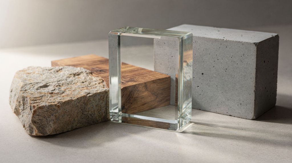
Film has a way of making materials feel present in your hands. Where digital often flattens a surface into a pattern, a good negative keeps the weight of stone, the breath of wood, the held tension of glass, and the quiet mass of concrete. You feel the grain not just in the emulsion but in the thing itself—provided your exposure, light, and stock are chosen with deliberate care. A limestone façade on Pan F Plus with a yellow filter holds centuries of tiny fractures; that same stone through a phone sensor ends up a clean, forgettable texture. The difference is reading the surface before you ever meter it.
Why materials matter in architectural photography
Architecture wears its materials like a biography. How a wall catches afternoon light, how a stone step hollows under decades of footfall, how condensation gathers on a glass balustrade—these aren’t decorative details, they’re the building’s living record. On film, that record becomes even more legible. Grain structure, the way a particular emulsion renders contrast, the subtle colour bias of a stock: all of it influences how texture translates. A rough brick wall on Tri‑X 400 holds a different truth than the same wall on Ektar 100. When I walk onto a location, I spend the first few minutes just touching surfaces—not for theatrics, but because the tactile memory informs how I’ll expose later. Smooth render, pitted sandstone, oiled oak, and polished marble each demand their own conversation with light, and film is an unforgiving listener if you ignore the nuance.
The core challenge: light behaves differently on every surface
The quickest upgrade you can make as an architectural photographer isn’t a new lens or a rare film stock. It’s learning to read each material individually instead of metering the scene as one lump of light. A white marble column next to a dark timber ceiling in the same frame will fool any averaged reading, and film’s latitude, while generous, won’t save a composition if you’ve killed the character of both.
Four things to evaluate before you press the shutter
- Surface texture: smooth, rough, porous, polished, layered. On a coarse stone, nearly any side light will throw micro‑shadows; on polished concrete, even a slight angle change can turn the surface into a giant reflector.
- Reflectivity: matte, semi‑gloss, mirror‑like. A glossy enamel finish might read half a stop brighter than you expect through a spot meter, while a truly matte surface soaks up light.
- Direction of light: front light flattens, side light sculpts, backlight creates silhouette and edge, raking light (the low sun just kissing the face) pulls out topography you’d miss otherwise.
- Contrast range: how far apart are the brightest highlight and the deepest shadow on that surface? Slide film will choke fast; negative film forgives, but you need to know where you’re placing the mid‑tone if you want the material to read correctly.
A habit I lean on is walking the space twice. First pass I look for the composition—the bones of the frame. Second pass I track only light behaviour: where it glares, where it feathers, where it disappears. That second walk often saves a whole roll.
Film choices that help with materials
Stock choice isn’t a formula, but it stacks the odds. Slow films generally deliver finer grain and greater resolving power, which matters when you’re photographing the saw marks on a floorboard or the hairline cracks in a plaster wall. Faster films bring visible grain that can feel gritty and honest on rough stone or weathered wood, but on smooth surfaces it can read as noise rather than texture. Below is how I typically pair materials with emulsions, though the light on the day always gets the final say.
| Material | Film approach | Why it works |
|---|---|---|
| Stone | Fine‑grain black‑and‑white (Pan F Plus, Delta 100, Acros II) or neutral colour negative (Portra 160, Ektar 100 if the light is cool) | Preserves micro‑texture and edge definition without adding artificial crunch. Neutral colour keeps the stone’s native hue from shifting. |
| Wood | Warm colour negative (Portra 400, Pro 400H if you can find it) or soft black‑and‑white (Tri‑X 400 shot at 320) | Renders tonal richness and subtle grain that complements the organic pattern. Avoids oversaturation that makes timber look plastic. |
| Glass | Lower‑contrast colour film (Portra 160 or 400) or black‑and‑white with gentle development (Delta 100 in DD‑X pulled slightly) | Helps hold highlight detail in reflections and prevents the glass from turning into a white blank. Control is more about exposure and angle than stock. |
| Concrete | Black‑and‑white with a mild yellow or orange filter (T‑Max 400, FP4 Plus) or restrained colour palette (Portra 160, sometimes Ektar for cool, graphic looks) | Emphasises mass, tonal separation, and the imprint of formwork. Avoid stocks with heavy colour casts that turn grey into a tinted mush. |
On interiors, a tripod isn’t optional—it’s the gateway to slower, finer‑grained films and smaller apertures. That combination lets you hold both the grain of the floorboard and the texture of the plaster in the same frame without compromise. Equally, a cable release keeps your hands off the body during those half‑second exposures that pull the deepest detail out of shadow.
Photographing stone: show weight, not just pattern
Stone is the material that taught me the most about light. Hit it flat from the front and you get wallpaper—a pattern divorced from the mass. But let the light graze across the face, even slightly, and suddenly every chisel mark, every erosion line, every fossil fragment tells you something about time. On film, this effect is amplified because the emulsion’s gradation from highlight to shadow has a gentler roll‑off; the texture doesn’t just appear, it breathes.
What works best with stone
- Use raking light—early morning or late afternoon when the sun is low. On an overcast day, a single daylight‑balanced LED panel placed at an oblique angle can mimic it.
- Expose for the mid‑tones. Stone often sits in a narrow tonal band, and if you meter only the brightest corner, you’ll lose the subtle colour shifts in the middle values.
- Let shadows explain depth rather than block it. A shadow falling across a joint or a carved detail gives the eye a way to measure volume.
- Look for edges, mortar joints, and worn corners—they carry the building’s age. A single crumbling quoin photographed close on Pan F Plus can tell a longer story than a full elevation shot.
Common mistakes
- Shooting at midday under harsh top light, which either washes out pale stone or punches contrast so hard you lose half the relief.
- Overexposing pale limestone or marble until the delicate surface texture fades into a smooth white field. On film, a stop over is safer than two under, but with bright stone you still need to guard the highlights.
- Cropping too tightly so that scale disappears. A block of stone without context becomes geology, not architecture.
When stone is the hero
If the project centres on the stone itself—say a historic façade or a hand‑carved fireplace—let the frame stay quieter. Give the material room. A sliver of floor, a shadow line from a window mullion, the edge of a neighbouring wall in softer focus: these help the stone feel embedded rather than like a sample card. Sometimes I’ll shoot a single wall twice, once with a touch of context and once as an abstract texture study, then decide later which holds the room’s memory more truly.
Photographing wood: preserve tone and grain without over‑saturating
Wood trips up more photographers than it should. It’s warm, it’s welcoming, and it’s alarmingly easy to push into cartoon territory—overcranked saturation, hyper‑sharpened grain, contrast so heavy the board looks veneered in lacquer. Film naturally reins that in. A good colour negative like Portra 400 renders oak or walnut with a muted, honest warmth; the grain acts like a fine patina rather than digital noise. Black‑and‑white stocks can turn timber into a study of light itself, especially when the finish is matte and the grain direction pulls your eye through the frame.
What to watch for
- Grain direction: it’s a compositional line you didn’t place, so use it. Horizontal boards widen a room; vertical panelling lifts the eye.
- Finish: raw wood drinks light, oiled wood glows, polished varnish becomes a soft mirror, and weathered paint peels into a different texture altogether. Each finish shifts the exposure by a quarter to a whole stop.
- Colour shift: warm afternoon light through a window can turn light oak aggressively orange on film. A slight cooling filter or a stock like Ektar (which leans cooler) can balance it, though sometimes you want that glow.
- Wear: scratches, dents, and sun‑bleached patches aren’t flaws—they’re the wood’s diary. Metering to hold detail in those worn areas often reveals more than a pristine board could.
Best practices for wood
- Soft side light or window light at an angle works wonders, brushing across the grain and lifting every ridge.
- If the wood is dark—stained walnut, ebony floors—give it a little more exposure than the meter suggests. I’ll often meter for the shadow side of the board and open up a third to half a stop, because film holds highlight detail better than it recovers buried shadow.
- Avoid clipping highlights on varnished surfaces. A specular glint on polished timber can blow fast; if you see one, shift your position slightly before metering.
- Include a contrasting material nearby—a plaster wall beside stained wood, a stone hearth against timber flooring. The juxtaposition makes both materials read more clearly.
Typical error
Underexposing dark wood for fear of losing ceiling highlights. The result is muddy, grain‑choked shadows with no discernible grain or depth. A slightly longer exposure (or a wider aperture) usually gives cleaner separation, letting the wood sit in its own zone. I’ve rescued more dark‑wood interiors with +1 stop than with any post‑processing trick.
Photographing glass: control reflections before they control you
Glass is almost never about the glass itself. It’s about what it reflects, what it reveals, and what it conceals. On film, a reflection can be a delicate ghost or a glaring distraction—often in the same frame. The emulsion’s response to bright highlights tends to be more forgiving than digital clipping, but that doesn’t mean you’re off the hook. You have to choreograph your own position and the light’s angle as carefully as a dance, because one step sideways can turn a messy glare into a clean, layered composition.
What makes glass difficult
- It mirrors you, the room, the sky, the tripod—anything with contrast. I’ve ruined enough frames by forgetting my own reflection in a dark window.
- It can blow highlights faster than matte surfaces. A sun‑struck pane on a bright day can easily run three or four stops over the ambient interior, leaving a featureless white shape.
- It can merge with the background, losing its edges. Without a defined rim or a deliberate highlight, a glass partition becomes invisible.
- It can feel empty unless composition gives it a job—framing a view, reflecting a texture, separating two spaces.
Techniques that help
- Shift your position first, before touching exposure. A slight change in angle often solves the worst reflections without any filter.
- Use a polariser only when it genuinely improves the image. Over‑polarised glass can look dead and plastic; I usually turn the filter just enough to take the edge off the glare while leaving a hint of reflection so the surface still reads as glass.
- Shoot at an oblique angle when you want to separate the pane from the scene behind it. Straight‑on, you get a mirror; at 30–45°, you get transparency and a sense of depth.
- Guard the highlights. Spot‑meter the brightest part of the glass and place it no higher than Zone VIII if you’re thinking in zone terms, or use an incident meter just outside the brightest beam and trust the film’s shoulder to hold the rest.
Good uses of glass in architectural images
- To frame another material behind it: a timber ceiling seen through a glass roof feels layered and deliberate.
- To show transparency and depth, connecting inside to outside or one room to another.
- To catch changing light across a facade—morning light sliding across a curtain wall creates a moving gradient that tells time.
- To contrast hardness with softness: glass beside rough‑sawn timber or rough‑cast concrete, the tension makes both materials more vivid.
If the glass is relentlessly reflective, don’t fight it. Compose with the reflection as the subject. A reflected tree or skyline against a dark interior window can become the most interesting part of the frame.
Photographing concrete: keep it honest and deliberate
Concrete can be the most generous or the most thankless material in architecture. Neglect it and you get a grey blur. Pay attention, and it reveals board marks, aggregate, pour lines, and a hundred shades of grey that shift with the light. On film, concrete often finds its truest voice in black‑and‑white, where grain and tonal separation do the heavy lifting without the distraction of colour casts. Even on colour stock, a restrained palette can turn a concrete wall into a quiet, monumental canvas.
What concrete needs
- Clean perspective and careful verticals. A tilting concrete plane quickly feels unstable, unless the architecture deliberately warrants it.
- Enough shadow to reveal form. Without shadow, concrete becomes a flat swatch; with just a sliver of shadow along an edge, it gains volume.
- A full tonal range that shows its surface variation—the subtle mottling, the imprint of the formwork, the patina of weather.
- Simple composition. Strong concrete architecture doesn’t need a busy frame; let the structure speak.
Best light for concrete
- Overcast light: even, soft, reveals every nuance of texture without drama. This is my go‑to for documenting concrete surfaces, especially on fine‑grain black‑and‑white.
- Side light: perfect for exposed aggregate or board‑marked concrete, where the low sun throws the texture into sharp relief. A yellow filter deepens the shadows just enough to accentuate the grain of the surface without losing the grey fidelity.
- Low sun: creates long shadows and strong geometry, ideal for emphasising mass and scale. At dawn or dusk, a couple of minutes can change the whole mood of a concrete structure.
What to avoid
- Too much contrast, which can compress concrete into a blank mass. If the light is harsh, I’ll wait for a cloud or move to a shaded view, because film handles mid‑tone separation better when the range is reasonable.
- Colour casts from nearby surfaces—a green‑painted wall reflecting onto grey concrete can tint the whole frame on colour negative film. A grey card reference shot or a colour meter can save a lot of heartache.
- Tilted framing that makes large planes feel unstable, unless you’re intentionally working with dynamic angles. A slight converging vertical is fine; a drunk‑looking wall is not.
Concrete rewards restraint. The stronger the architecture, the less visual noise the frame needs. Sometimes, just the junction of a wall and a floor, with the right light and a square frame on a 6×6 camera, says everything.
A simple field workflow for material‑focused shooting
When I’m on site with a specific material in mind, I follow a repeatable sequence. It prevents me from just firing off descriptive shots and pushes me to treat the material as the subject. Film forces a deliberate pace anyway—no chimping, no burst mode—so this rhythm works with the medium, not against it.
Step‑by‑step approach
- Identify the dominant material in the scene. Is the stone the story, or are you documenting how the wood floor meets the concrete plinth?
- Study where light hits that surface and where shadows collect. Walk around it. Crouch down. Notice how the texture changes with angle.
- Decide on the feeling: should the material read as soft, sharp, warm, cold, heavy, reflective? That decision guides everything from stock choice to development time.
- Choose a film stock that supports that feeling. You don’t have to swap mid‑roll if you’re already loaded, but make a mental note for the next frame if the current stock is fighting you.
- Meter for the part of the surface that must hold detail. With stone, that’s the mid‑tone; with glass, the highlight; with wood, the shadow side.
- Make one frame for texture (close, abstract), one for context (the material within the room), and one for relationship (how it meets an adjacent material). This trio gives you editing options later.
- Review the scene again after the light changes. Even twenty minutes can transform the way a surface reads; I often re‑shoot a material hours later when the sun has moved.
Exposure tips by material
Metering for materials is a balancing act. I tend to think in terms of what must be preserved rather than what the overall scene averages. The table below distils those priorities into a quick reference you can carry in your head on location.
| Material | Exposure priority | Risk if mishandled |
|---|---|---|
| Stone | Midtones and texture; place them at your film’s sweet spot (often Zone V for B&W, neutral grey for colour) | Flat surface devoid of micro‑contrast, or blown‑out highlights on pale varieties where detail vanishes |
| Wood | Shadow detail and warmth; give dark wood a little more exposure to lift the grain out of the foot of the curve | Muddy blacks with no visible grain, or oversaturated tones that make the wood look like plastic |
| Glass | Highlights and reflection control; protect that highlight edge so the pane doesn’t become a white hole | Washed‑out windows, distracting glare, or a surface that disappears entirely |
| Concrete | Form and tonal separation; enough shadow to reveal mass, crisp mid‑tones to show the surface variation | Lifeless grey planes that read as a block, not a building material |
When you’re uncertain, protect the highlight detail first—especially with glass and pale stone. Colour negative film can recover a lot from the shadows, but once a highlight blows, it’s gone. Slide film is even less forgiving, so bracket if you can spare the frame.
Natural light strategies for real spaces
Natural light is the most honest source for material photography because it’s how surfaces behave in everyday life. Flash can freeze texture, but it often strips away the ambient narrative that film captures so beautifully—the colour temperature shift across a room, the gradual fall‑off into shadow. I carry a small reflector for emergencies, but most of the time I let the building’s own light do the work.
Use these lighting conditions intentionally
- Overcast days: nature’s softbox. Perfect for even readings of texture on stone and wood. On a fine‑grain black‑and‑white stock, an overcast sky reveals the quietest details—hairline cracks, saw marks, faint trowel lines—without dramatic shadows to distract.
- Morning and late afternoon: strong for side light and tactile detail. The low sun rakes across surfaces, carving out every undulation. A 35mm lens with a yellow filter makes those shadows sing, especially on stone and board‑marked concrete.
- Blue hour: that twilight window when interior lights and exterior dusk balance. Glass facades glow with a cinematic tension; concrete takes on a cool, moody depth. I love Portra 800 here, pushed a stop if needed, to drink in the ambient mix.
- Window light in interiors: excellent for wood and stone, especially when it falls across surfaces at an angle. The directional light from a single window creates a natural gradient that highlights grain direction and patina. Film records that gradient with a subtlety that digital sometimes misses, especially in the transition areas.
A material doesn’t need drama to be interesting. Some of the most revealing frames I’ve made were on soft, overcast afternoons, where the only story was the grain of the floor and the weight of the stone wall.
Practical checklist before you shoot
A mental checklist keeps you from forgetting the basics when the light is fleeting. Here’s what I run through before each material‑focused frame.
Material photography checklist
- Check how the surface reacts to direct and indirect light. Touch it if you can—your hand will tell you things your eye might miss.
- Clean the frame of distracting highlights and stray reflections. A chair leg, a camera bag, your own silhouette—check the edges.
- Confirm verticals and lines before committing. A tilted line on a material edge can throw the whole sense of structure.
- Meter for the surface, not the overall scene. A spot meter is your friend; use it to place the material’s key value exactly where you want it.
- Look for edges, seams, joins, and imperfections. They give scale and authenticity.
- Decide whether the material should feel isolated (a texture study) or part of a larger architectural story (an environmental portrait).
- Take at least one close view and one contextual view. You’ll thank yourself later in the edit.
Common mistakes to avoid
Over the years, I’ve made—and corrected—all of these. Film has a long memory, so it’s worth learning them once.
- Treating all materials with the same exposure. White marble and black oak in the same frame can’t both be happy with a single meter reading. This is where a spot meter and manual exposure become non‑negotiable.
- Ignoring how film stock changes the emotional tone of the surface. A warm, grainy film on cool limestone can feel nostalgic; that same stock on polished concrete might look muddy. Match the stock to the mood of the material.
- Using harsh midday light on reflective or pale materials. The sun directly overhead flattens texture and introduces contrast that even the best film can’t tame. If you must shoot then, find open shade or wait for a cloud.
- Forgetting scale, so texture becomes abstract. A close‑up of a stone wall without a window frame or a human reference loses its architectural grounding. Include just enough context to anchor the eye.
- Overediting your mental approach before taking the image. The material should lead the composition. If you arrive with a rigid pre‑conception of how the frame “should” look, you’ll miss what the surface is actually offering.
- Neglecting reciprocity failure. In dim interiors, those multi‑second exposures can push your film into non‑linear territory. Check your film’s data sheet for reciprocity compensation, especially with black‑and‑white stocks, or you’ll underexpose and lose shadow detail in dark wood or stone corners.
FAQ
Which film stock is best for photographing architectural materials?
There’s no single best stock, and that’s part of the beauty of analog. For stone and concrete, fine‑grain films like Ilford Delta 100, Fuji Acros II, or Kodak T‑Max 100 deliver micro‑texture without intrusive grain. Wood often loves the warm, natural palette of Kodak Portra 160 or 400; for black‑and‑white, Tri‑X shot at 320 gives a soft, organic grain that feels right with timber. Glass relies more on careful exposure than a specific emulsion, though lower‑contrast colour negatives help preserve highlight detail. In the end, the way you meter and the light you wait for will matter more than the name on the canister.
Should materials be photographed in colour or black and white?
Colour works best when the material’s tone and aging are the story—the honeyed glow of old oak, the warm grey of centuries‑old limestone, the patina on copper flashing. Black and white is stronger when texture, structure, and contrast lead the narrative. I often load two bodies, one with colour negative and one with black‑and‑white, and let the surface tell me which to reach for. Sometimes a material demands both.
How do I make stone look more textured on film?
Use side light or low raking light, expose carefully for the midtones so the stone’s subtle variation isn’t lost, and avoid front light that flattens everything into a pattern. On black‑and‑white, a yellow or orange filter can deepen the shadows enough to pull out relief. If you’re shooting colour, a slight underexposure of a third of a stop can sometimes intensify texture by shifting the tone curve, but don’t overdo it or you’ll bury the shadows.
Why does glass look better in some frames than others?
Glass desperately needs composition to explain itself. If the reflections, background layers, or light direction are unclear, the pane either vanishes or becomes a glare bomb. A strong frame with glass usually has one clear job for the glass: it frames, it reflects a meaningful element, or it separates spaces. When the glass has purpose in the composition, it reads as intentional rather than accidental.
Is a tripod necessary for material photography on film?
Yes, and I can’t emphasise this enough for architectural interiors. A tripod frees you to use slower, finer‑grained films and smaller apertures without pushing the limits of handheld steadiness. When you’re chasing the texture of a wall or the grain of a floorboard, even a subtle camera movement can smear the detail you’re fighting to preserve. Plus, a locked‑down camera lets you study the frame edges and reflections with the same care you give the metre reading.
Conclusion
Photographing stone, wood, glass, and concrete on film becomes a practice of listening. Stone asks for side light to reveal its weight and age. Wood asks for warmth and restraint, so its grain tells a story instead of shouting. Glass asks for control—of angle, reflection, and highlight—so it can dissolve or define as the building intends. Concrete asks for clarity and the patience to let its form hold the frame without distraction. The deeper you read each material before you trip the shutter, the more the final image will feel like a living record of the place, not a documentation. That’s what analog does best: it translates matter into memory, one surface at a time.