A Film Case Study of a Modernist Interior
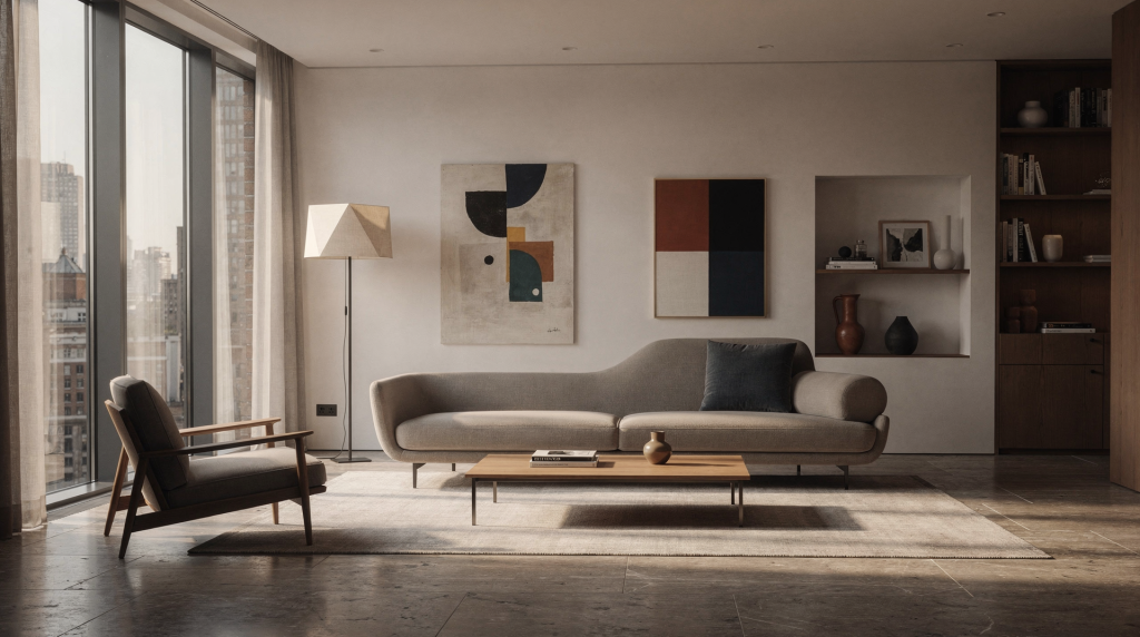
A modernist interior strips away the excess, leaving only light, proportion, and material to carry the experience. That kind of clarity is exactly where film shows its strengths. Digital capture might deliver a clinically accurate inventory of the room, but film translates the space — it records how daylight slumps across a bare plaster wall, how grain settles into the grain of timber, how the whole atmosphere shifts when a cloud passes. This case study isn’t about proving film is better; it’s about understanding what happens when you let the medium slow you down and listen to the architecture.
Why Modernist Interiors Work So Well on Film
Modernist rooms are built on restraint. Clean lines, open plans, flat planes, and a tight material palette leave very little visual noise. That makes every tonal shift matter — a half‑stop difference between a matte painted wall and a softly polished concrete floor becomes the entire story. Film responds beautifully to that discipline because it records the space as a layered field of highlights, shadows, and grain, rather than a sterile inventory of objects.
For these interiors, film also brings something digital often smooths over: the sense that light is moving across the room rather than sitting on top of it. That matters enormously when the architecture depends on daylight. The difference between a wall that reads as stark white and a wall that reads as warm, slightly chalky, and alive can change the whole emotional register of a frame. With a good negative stock, the highlight rolloff around a window keeps the light soft instead of clipped, and the shadow areas hold a subtle texture you can feel.
The Assignment: Photographing a Calm, Material-Driven Home
The interior in this case study was defined by three things:
- large windows with directional daylight
- restrained finishes such as timber, plaster, stone, and painted surfaces
- a plan that opened gradually from one room to the next
That combination sounds simple, but it creates a real exposure challenge. Bright window areas can sit several stops above the interior shadows, and modernist rooms tend to expose any mistake in verticals, focus, or flare with brutal honesty. A film approach forces discipline here: every frame has to earn its place, and you learn to read the light the way an incident meter reads a room — as a whole, not as a set of isolated patches.
What the space needed to communicate
The brief was not “show every room.” It was to show how the home feels when light enters it. That changes the way you work. Instead of treating the interior like a product shoot, you look for moments where structure, atmosphere, and use overlap naturally. It’s the kind of brief that makes you load a roll of Portra 400 and keep the tripod low, scanning for the quietest corner where the morning light first touches the floorboards.
Good frames in a modernist interior usually do one of four jobs:
- explain the spatial layout
- reveal the relationship between daylight and surface
- show how material ages or softens over time
- give the viewer a sense of scale and stillness
Choosing Film Stock for Modernist Interiors
Film stock choice shapes the final story as much as composition does. For interiors, the main question is whether the image should feel crisp and clinical or warm and atmospheric. Over years of shooting architecture on everything from 35mm to 6×7, I’ve learned that your stock is a narrative decision, not a technical one.
| Film stock approach | Best use | Visual result | Tradeoff |
|---|---|---|---|
| Color negative, ISO 160–400 | Window-lit interiors with changing light | Flexible exposure, gentle highlight rolloff, natural color | Requires careful scanning and color control |
| Lower-speed color film | Controlled daylight and stately rooms | Cleaner tonality, finer grain, smoother surfaces | Less forgiving in dim corners |
| Black-and-white film | Material studies, graphic architecture, texture-led work | Strong emphasis on shape, contrast, and structure | Color relationships are lost |
| Medium format film | Editorial and archive-quality interior coverage | Rich detail, subtle tonal transitions, quiet presence | Slower workflow, fewer frames per roll |
For a modernist interior, medium format is especially effective because it gives walls, wood grain, and joinery enough room to breathe. A 6×6 or 6×7 negative renders a painted wall not as a flat tone but as a landscape of micro‑variations — the faint brushstrokes, the slight unevenness of plaster — that digital sharpening rarely touches without feeling artificial. I often reach for a low‑contrast black‑and‑white stock like Ilford FP4+ when the project is about structural clarity, or a color negative like Ektar 100 when the daylight is steady and the palette deserves precision without sterility.
How to Meter a Bright Interior Without Losing the Room
Interior film work is won or lost at the meter. Window light is rarely the problem by itself; the problem is contrast. Modernist homes often pair pale walls with deep shadows and bright openings, so a single meter reading from one area describes almost nothing about the actual scene. My incident meter is the first thing I unpack, and I use it to build a mental map of the room’s tonal range before I even look through the finder.
A practical metering method
- Take an incident reading in the interior if possible — it gives you the baseline for the room as it feels to the eye.
- Spot-meter the midtones on walls, flooring, or upholstery; those will anchor your exposure.
- Check the brightest usable highlight near the window; on color negative film you can often place this at +3 stops without losing all detail.
- Decide what must hold detail and what can fall to shadow — let the architecture’s priority guide you.
- If the contrast feels too high, bracket the frame in half‑stop increments, especially when the light is changing fast.
On black‑and‑white negative film I’m comfortable letting deep shadows drift into charcoal, because that grain‑rich darkness reinforces the stillness of the space. With color negative I’m more protective of shadows, because underexposed color neg can get muddy in the scan.
Common exposure mistakes
- metering only for the window and underexposing the room — you end up with a bright rectangle and a cave
- overexposing pale walls until they lose texture — that chalky plaster character vanishes above +2 stops on slide film or in the scan curve
- ignoring reflective surfaces such as polished floors or glass — a meter reading from a highlight bouncing off a coffee table can throw your entire exposure off
- trusting the scene to “sort itself out” in scanning — a thin, underexposed negative will never sing, no matter how much you push the sliders
Working With Natural Light
In a modernist interior, natural light is not just illumination. It is part of the architecture. The best frames usually come when the sun creates shape rather than when the room is evenly flooded. I’ve spent countless mornings walking a space before loading a single roll, watching how the light track slides across a joint in the floor or climbs a wall over the course of an hour. That observation is half the photograph.
Morning and late afternoon often work well because side light reveals texture and depth. Overcast light can also be excellent when the room has strong geometry and you want softness instead of drama. Window light becomes especially useful when it lands on a wall or floor at an angle that shows the material instead of flattening it. A linen curtain diffusing direct sun can turn a harsh rectangle of light into a gentle wash that models every subtle contour.
What to look for in the room
- visible light falloff across walls or floors — the gradient tells the story of the window’s position
- shadows that clarify the plan rather than clutter it — a cast shadow from a mullion can draw a clean line through the frame
- reflections that add context without becoming distractions — a soft glint on a stone bench top adds material presence
- one strong source of daylight instead of several competing ones — multiple windows at different angles can fracture the light and confuse the meter
Composition: How to Photograph Stillness Without Making It Static
Modernist interiors often fail when the photographer becomes too symmetrical. Clean lines are important, but perfect symmetry can remove life from the image. The better approach is usually controlled imbalance: enough structure to feel intentional, enough shift to suggest occupancy and movement. On a tripod, even a slight nudge of the head can transform a rigid grid into a breathing composition.
Strong composition choices
- shoot through a doorway to create layers — the door frame becomes a natural crop that adds depth
- include part of a chair, table, or built‑in element for scale — a modernist room risks feeling like a scale model without a hint of human presence
- use leading lines from floors, beams, or window frames — these pull the eye through the plan
- leave negative space where the architecture needs room — a blank wall can hold as much weight as an object
Frames that tend to work best
- a wide establishing view showing plan and daylight — this sets the spatial context
- a mid‑range composition focused on materials — where wood meets plaster or stone meets glass
- a detail frame of joinery, texture, or light pattern — the quiet moment the camera was made for
- a transitional image between rooms to show flow — often shot from a low position to emphasize the opening
A Simple Interior Shooting Workflow
A reliable workflow keeps the shoot calm and efficient. For me, it starts long before the shutter is cocked — with a slow walk, a sketch of the light, and a decision about which film stock feels right for the mood of that particular morning.
Step by step
- Walk the space before loading the camera. Notice the temperature of the light: cool, neutral, or warm.
- Observe where daylight is strongest and where it softens — this determines your shooting order.
- Identify the dominant lines and the cleanest sightlines; remove stray objects if possible.
- Set the tripod and level carefully — a spirit level is essential; correcting converging verticals in a scan is never as clean as doing it right on the negative.
- Meter for the tonal range you want to protect, using an incident reading as your touchstone.
- Shoot the hero frame first while the light is still at its best — the moment the sunbreaks after a cloud is fleeting.
- Make detail frames before the room changes too much; I often dedicate a whole roll just to material close‑ups.
- Recheck exposure if clouds move or the sun shifts — even a half‑stop drift can matter on a slower film.
- Keep notes on frame number, composition, and meter reading; in a darkroom or scan session, those notes are gold.
- Review contact sheets or scans with the original light pattern in mind — memory serves better when you’ve written it down.
Practical Checklist for Modernist Interior Shoots
- tripod packed and leveled
- lens cloth and blower ready
- incident or spot meter available
- film stock chosen for contrast level and color palette
- lens checked for flare — modernist rooms with bright windows are flare traps
- verticals corrected in‑camera where possible
- cable release or steady shutter method used
- notes taken for each key frame
- backup roll(s) loaded for bracketing
- scan intent considered before the shutter is pressed — knowing whether you’ll print or scan influences exposure choices
The Details That Separate a Good Frame From a Generic One
A modernist interior is full of small decisions. Those details matter because the architecture itself is usually restrained. The photograph has to carry the feeling, and on film that feeling lives in the subtleties — the faint edge of a highlight, the texture of a surface, the way shadow thickness changes at a corner.
Watch for these elements
- edge highlights on plaster or painted walls — a razor‑thin line of light can define the entire plane
- the difference between matte and reflective materials — a limestone floor next to a glossy lacquered cabinet is a story of surface
- the way a curtain softens window contrast — it diffuses not just light, but the whole mood of the room
- the grain of wood against smooth stone or terrazzo — these material pairings read as tactile on film, especially on medium format
- the shape of shadows at thresholds and corners — notice how the shadow crushes softly into the dark, holding just enough detail
These details are not decorative. They tell the viewer how the room behaves in real light, and they’re the reason I often shoot an extra half‑stop of exposure to protect shadow texture when the light is gentle.
Analog vs Digital in Interior Documentation
Both formats can document architecture well, but they do not produce the same emotional result. Digital gives you certainty; film gives you presence. When I deliver a set of digital images, the client knows exactly what they’ll get. When I hand over a contact sheet from a 6×7 shoot, they feel the weight of the space.
| Aspect | Film | Digital |
|---|---|---|
| Tonal response | Soft highlight rolloff, layered shadows | High precision, easier correction |
| Texture | Grain adds physical presence | Cleaner, more clinical surface |
| Workflow | Slower and more intentional | Faster and more flexible |
| Emotional feel | Reflective, archival, atmospheric | Immediate, exact, efficient |
| Best use | Story‑led interiors, heritage spaces, editorial work | High‑volume documentation, fast delivery |
For a modernist interior case study, film is valuable when the aim is interpretation, not just record‑keeping. It can preserve the feeling of the space as much as its layout — the way light pools on a terrazzo floor at 10 a.m., the specific softness of a linen curtain in the afternoon, the patina on a brass handle that digital would probably sharpen into something else.
Typical Problems and How to Handle Them
Problem: The windows are too bright
Use heavy bracketing, shift your angle so the window becomes an edge element, or wait for softer light when clouds pass. In black‑and‑white, you can also burn the windows in during a darkroom print, but it’s always better to capture the range on the negative.
Problem: The room feels flat
Look for side light, shadows from frames or blinds, or a lower camera position that restores depth. Even a subtle shift from eye‑level to waist‑level can reintroduce the spatial layering that symmetry dilutes.
Problem: The image looks too empty
Add one contextual element — a chair, lamp, or doorway edge — instead of filling the frame randomly. On film, that single object holds more visual weight because the grain and tonal transitions around it give it a sense of belonging.
Problem: The scan looks dull
Check whether the negative was underexposed first. A thin negative will always feel flat, no matter how you adjust the scan. Review your contrast during scanning rather than forcing the image in post; a good scan from a well‑exposed negative needs very little correction.
What Makes a Strong Film Case Study
A good film case study should not just show the room. It should show how the room behaves — how it receives morning light, how materials age into each other, how the stillness of a space feels on a quiet afternoon. That means including:
- an establishing image of the full space
- a mid‑frame that explains circulation or use
- a detail that reveals material character
- a light study that shows the architecture at a specific moment
- a caption or note explaining why that frame mattered — where the meter was placed, what the light did, why that composition held the whole story
That structure turns a gallery into a useful reference for designers, photographers, and architecture readers, and it keeps the film conversation grounded in practice, not nostalgia.
Conclusion
A modernist interior is one of the best subjects for film because the medium rewards restraint, texture, and light control. When the approach is thoughtful, film does more than document a space: it preserves the atmosphere that gives the space meaning. The strongest images are rarely the most complex; they are the ones that make the viewer feel how the room receives daylight, holds material, and settles into silence. Every time I load a roll of 120 in a light‑filled modern room, I’m reminded that the camera isn’t just a recording device — it’s a way of listening to the architecture.
FAQ
What film stock is best for modernist interiors?
Medium format color negative film is a strong all‑round choice because it balances detail, tonal subtlety, and forgiving highlight rolloff. For a purely textural study, a low‑ISO black‑and‑white film like FP4+ or Acros can be even more revealing.
Should interior architecture be shot on a tripod?
Yes. A tripod is essential for precise framing, stable exposure, and consistent results in low‑light interiors. It also forces the kind of slow, deliberate composition that modernist spaces deserve.
How do you keep windows from blowing out?
Meter carefully, expose for the important tones, and bracket when the contrast between the interior and the windows is too high. In many cases, exposing for the interior midtones and letting the window go a little bright — while still holding subtle detail — gives a more natural, lived‑in feel than a perfectly balanced HDR look.
Why does film suit modernist interiors so well?
Film handles texture and tonal transitions in a way that often feels more atmospheric and less clinical than digital capture. The grain becomes part of the materiality of the space, and the highlight rolloff mirrors how our eyes adjust to a bright window.
What should be included in a case study gallery?
Include an overview frame, a material detail, a light‑focused image, and one or two transitional compositions that explain the layout. Each frame should be accompanied by a short note about the intention and exposure choices to give viewers a look inside the process.