Choosing a Film Stock for Architectural Photography
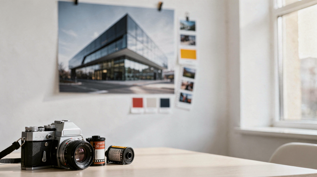
When I walk into a space with a loaded film camera, I’m not thinking about resolution charts or line pairs. I’m watching how light wraps around a column, how the grain of the plaster catches the window light, and how the emulsion in my camera will translate those details into an image that feels as authentic as the room itself. Choosing a film stock for architectural photography is fundamentally about how the film interprets contrast, texture, and color — and every stock has its own distinct language.
Buildings are unforgiving subjects. Straight lines, reflective surfaces, mixed light, and deep shadow will expose weaknesses in the wrong emulsion. A stock that works beautifully for portraits can fall apart in interiors if it clips highlights too fast or turns neutral walls muddy. The right film won’t just record the space; it will hold the delicate gradient of light near a window and keep the shadow side of a room readable without flattening the mood. In practice, the best choice depends on lighting, color palette, format, and how much latitude you need to tell the story of the space honestly.
Why film stock matters in architecture work
Buildings demand a lot from an emulsion. Where a portrait subject moves and breathes, architecture stands still and holds every mistake up to scrutiny. I’ve lost count of the times a roll I loved for street photography turned a serene interior into something harsh and uninviting. Color negative films that saturate greens for landscape can make a subtle sage wall look radioactive. The core of the problem is contrast: a scene with deep window bays and dark corners might span six or seven stops, and your film’s shoulder and toe determine how much of that information survives on the negative.
For that reason, film choice in architectural photography usually comes down to three questions:
- How much contrast is in the scene?
- Is the light mixed, natural, or controlled?
- Do you want a faithful color rendering or a cleaner, graphic black-and-white look?
A good stock should support the space rather than dominate it. If someone looks at the photograph and thinks first about the film, the emulsion has gotten in the way. The goal is to let the architecture speak.
The practical shortlist: which film stocks work best
For most interior and exterior architectural assignments, a few films consistently make sense. I carry them based on what I expect to encounter, and after years of testing, these are the ones that stay in my bag.
Portra 400 is often the safest all-rounder because it has strong latitude and handles mixed lighting beautifully. It forgives small exposure errors and doesn’t punish you when a room contains both daylight and tungsten lamps. The grain is there, but in 120 it stays out of the way, and even in 35mm it reads as organic rather than distracting.
Portra 160 is a cleaner choice for bright interiors with soft daylight. It has a gentler contrast curve and a remarkably quiet grain structure, making it ideal when you want materials to feel understated and calm. Think pale walls, linen curtains, and morning light.
Ektar 100 is a different animal altogether. It’s best when you have plenty of light and want crisp detail with saturated color. I think of it for exterior façades, brickwork, and carved stone — subjects where the surface itself deserves to be the hero. The fine grain is remarkable, but it demands precise metering; underexpose even a little and the contrast ramps up unforgivingly.
For black and white, HP5 Plus and Tri-X are reliable choices when your goal is to emphasize structure, texture, and tonal separation. HP5 has a long tonal range that handles subtle gradations in plaster or concrete without becoming blocked up. Tri-X brings a grittier, classic contrast that makes architectural lines feel bold and graphic.
Quick comparison table
| Film stock | Best use | Strengths | Trade-offs |
|---|---|---|---|
| Portra 400 | Mixed-light interiors, general architecture | Flexible exposure, forgiving latitude, natural color | Grain is more visible than slower stocks |
| Portra 160 | Bright interiors, daylight rooms | Soft color, fine grain, calm rendering | Less flexible in dim spaces |
| Ektar 100 | Well-lit exteriors, detail-heavy facades | Very fine grain, high sharpness, saturated color | Can look too vivid in some interiors |
| HP5 Plus | Moody interiors, texture-focused work | Strong line emphasis, good flexibility | Grain is more noticeable |
| Tri-X | Graphic black-and-white architecture | Classic contrast, strong tonal character | Less neutral than slower B&W stocks |
How to choose by lighting condition
Bright daylight interiors
If the space is filled with natural light, Portra 160 or Ektar 100 are strong options. I tend to reach for Portra 160 when I want soft, restrained color and gentle transitions — the way late afternoon sun moves across worn floorboards, for instance. The film’s subtle palette handles warm wood tones and creamy plaster without pushing them into artificial territory. Ektar 100 is better when the room has enough light to support deep detail and you want the materials to feel vivid: think terracotta tile or a richly painted wall that deserves to sing.
Use these when:
- the room has large windows
- walls and finishes are light-toned
- you want a clean, editorial look
Avoid Ektar 100 when:
- the light is low
- the room contains strong mixed color temperatures
- you want a softer, more understated palette
Mixed lighting
Mixed lighting is where Portra 400 earns its reputation. Interiors often combine daylight from windows, tungsten lamps, and practicals — a haphazard soup of color temperatures that can make digital white balance a headache and lesser films turn splotchy. Portra 400’s generous latitude and neutral color balance soak up those differences without falling apart. The shadows stay open, the highlights roll off instead of blowing out, and the slight warmth in the emulsion actually ties the room together. I’ve shot historic homes where a single frame contained cool north light, a warm table lamp, and a dim hallway; Portra 400 made it feel like a considered painting rather than a lighting accident.
Use Portra 400 when:
- window light and artificial light are both present
- you are shooting quickly across changing conditions
- the room has deep shadows and bright highlights
This is usually the most practical choice for real-world interior work.
Low light or mood-driven spaces
If the assignment calls for atmosphere, black and white can simplify the scene and direct attention to form, materials, and rhythm. HP5 Plus and Tri-X work especially well when the goal is to show the geometry of staircases, corridors, facades, and textured surfaces. I often load HP5 when I’m photographing a building that relies more on silhouette than color — a stark modern house, a stone passageway, a room where the light itself becomes the subject. The grain becomes part of the texture; on medium format it’s barely there, but on 35mm it adds a tactile quality that suits worn materials perfectly.
Use black and white when:
- color is distracting
- the space has strong graphic lines
- the architecture benefits from tonal contrast more than color accuracy
Exterior façades and detail studies
For daylight exteriors, Ektar 100 is a solid choice because of its fine grain and sharp rendering. It is especially effective for brickwork, carved stone, decorative trim, and clean modern facades. I’ve pointed my lens at limestone details that looked unremarkable on a dull day; on Ektar 100 in bright light, every chisel mark became legible. The film’s inherent saturation can make a freshly painted door or a copper downspout feel almost sculptural. However, I meter carefully and often bracket because the film’s contrast curve leaves little mercy for shadows.
Use Ektar 100 when:
- you have strong daylight
- the building surface has fine texture
- you want detail to read clearly in large prints
Color vs black and white: what each does best
Color negative film is usually the better choice when the architecture relies on material honesty. Think painted millwork, aged plaster, warm wood, tile, or interiors where the relationship between light sources matters. The subtle shift from cool window light to warm lamp glow tells part of the story, and stripping that away can flatten the sense of place. Portra emulsions, in particular, render skin tones poorly — but they render wood, stone, and plaster with a sincerity that feels tactile.
Black and white is better when the subject is structure first. It removes color from the equation and makes edges, shadows, and surface texture the main event. I’ll often shoot a roll of HP5 alongside a color stock when documenting a historic space, because somewhere between the ornate wallpaper and the carved newel post, the simplicity of monochrome reveals the bones of the building. The film grain itself can become an ally, suggesting age and atmosphere that digital noise never replicates.
Choose color if you need:
- accurate material feel
- a sense of lived-in atmosphere
- subtle differences between warm and cool light
Choose black and white if you need:
- stronger emphasis on form
- less distraction from mixed lighting
- a timeless, documentary tone
Format matters as much as stock
Film stock does not work in isolation. Medium format and large format can make a stock look smoother and more detailed because the negative is larger. That matters in architecture, where straightness, tonality, and fine surface detail all benefit from more image area. I’ve seen the same Portra 160 in a 35mm body produce a perfectly acceptable image, but when I step up to 6×7 or 6×9, the grain essentially disappears and the texture of brick or stucco becomes incredibly refined. The larger negative also handles enlargement better; a detail study on medium format Ektar 100 can go to a 20×30 print without breaking a sweat.
If you shoot medium format, slower films such as Portra 160, Ektar 100, or a fine-grain black-and-white stock become even more attractive because the format already supports a cleaner rendering. In 35mm, a more forgiving stock like Portra 400 is often the safer option when you expect to crop, bracket, or work quickly. The smaller frame punishes underexposure more, so having that extra latitude keeps you out of trouble when you’re moving through a location without time to meter every corner.
A simple decision framework
Use this as a fast way to narrow your choice before a shoot. I run through these steps mentally while loading my bag, and they’ve saved me from showing up with a stock that fights the light.
Step 1: Identify the light
- Bright daylight everywhere: start with Portra 160 or Ektar 100
- Mixed daylight and lamps: start with Portra 400
- Dim or moody interior: consider HP5 Plus or Tri-X
Step 2: Define the mood
- Natural and understated: Portra 160
- Clean and crisp: Ektar 100
- Flexible and dependable: Portra 400
- Graphic and structural: HP5 Plus or Tri-X
Step 3: Match the stock to the output
- Editorial website use: Portra 400 or HP5 Plus
- Fine-art print emphasis: Ektar 100 or slower B&W stock
- Historic property documentation: neutral color stock or B&W, depending on the brief
Exposure and bracketing: the part people underestimate
Architectural scenes often exceed the contrast range your eye can comfortably hold in one glance. Windows are bright, corners go dark, and reflective surfaces can trick the meter. That is why bracketing matters so much in interiors. I’ve learned to stop trusting my spot meter alone and instead think about which surface I want to render faithfully. In a room with a sunlit window, exposing for the shadows might blow the view outside to white; exposing for the highlights crushes the furniture into silhouette. A single well-chosen frame might work, but bracketing gives you options later — and with film, you can’t see the histogram.
A useful approach:
- meter the midtones or a neutral wall
- check highlights near windows
- expose for the important surface, not the brightest area in frame
- bracket when the scene has large brightness differences
Portra 400 gives the most room for error in mixed light; it holds detail right up into the highlights and digs deep into shadows without becoming muddy. Slower films reward more precise metering, so do not treat them as “safer” just because they are finer-grained. I’ve ruined more rolls of Ektar 100 by assuming the small grain meant I could be lazy with exposure than I care to admit.
Common mistakes when choosing film for architecture
- Picking a stock for its look without considering the light
- Using a vivid film in a color-complex interior and ending up with unnatural saturation
- Choosing B&W only to “save” a difficult exposure, then losing material color that mattered
- Shooting too slow a film for a handheld interior with changing light
- Forgetting that one room can contain several color temperatures at once
Recommended starting points by scenario
| Scenario | Best starting stock |
|---|---|
| General interiors with windows and lamps | Portra 400 |
| Bright, airy rooms | Portra 160 |
| Exterior façades in daylight | Ektar 100 |
| Textured historic interiors | HP5 Plus or Tri-X |
| Mixed-light real estate documentation | Portra 400 |
| Fine-art architectural studies | Ektar 100 or B&W, depending on mood |
A practical checklist before the shoot
- Confirm whether the final use is documentary, editorial, or fine art
- Walk the space before loading the film
- Note the main light sources and their color temperatures
- Decide whether color adds value or distracts
- Bring a stock with enough latitude for the scene
- Bracket when windows or reflective surfaces dominate
- Keep one “safe” stock in your bag for unpredictable interiors
Final recommendation
If you need one film stock to start with, choose Portra 400 for architectural photography. It offers the most useful balance of latitude, color accuracy, and flexibility in real-world interiors. I’ve shot everything from sun-drenched living rooms to candlelit corridors with it, and it rarely disappoints. From there, move to Portra 160 for brighter daylight spaces where a quieter grain and softer palette bring tranquility, Ektar 100 for crisp exterior detail that demands precision, and HP5 Plus or Tri-X when the project is better served by a structural black-and-white interpretation that lets the building’s bones speak louder than its paint.
FAQ
What is the best film stock for interior architecture photography?
Portra 400 is usually the strongest all-around choice because it handles mixed lighting and offers generous exposure latitude.
Is black and white good for architectural photography?
Yes. Black and white often works especially well when you want to emphasize shape, texture, and light rather than material color.
Is Ektar 100 good for buildings?
Yes, especially for daylight exteriors and detail-rich facades, where its sharpness and fine grain can really shine. I treat it like a fine chisel for surface detail.
Which stock is best for historic interiors?
Portra 400 is the most flexible option, while HP5 Plus or Tri-X can be excellent if you want a more tonal, timeless look.
Should I use 35mm or medium format for architecture?
Medium format often gives a cleaner, smoother result for architectural work, with significantly finer grain and more detail in textures, but the best choice still depends on the pace of the shoot and the amount of detail you need. If you’re working quickly or traveling light, 35mm with a forgiving stock is a worthy compromise.