Working with Mixed Light in Interior Spaces
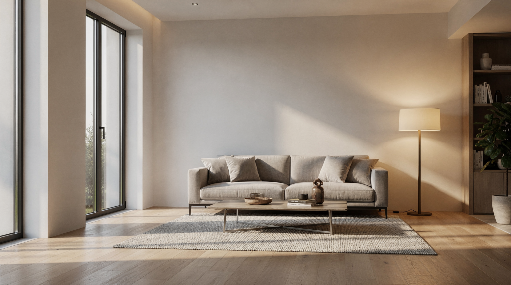
Mixed light is one of the most common and most underestimated challenges in interior photography. In a single room, you may have daylight from windows, tungsten lamps, LED panels, fluorescent spill, and reflections from painted walls — each with a different color temperature, each pushing the scene in a different direction.
For film photographers, this is not just a technical problem. It is a creative decision. Mixed light can flatten a space, distort materials, and make whites look dirty, but it can also reveal the atmosphere of a room in a way that feels honest and lived-in. The key is learning when to simplify the light, when to balance it, and when to let the contrast remain.
When I load a roll of Portra 400 or Tri-X 320 into the back of the Mamiya RZ67, I’m already thinking about color temperature. Not as an abstract concept — as a physical pressure on the emulsion. Film doesn’t negotiate with light the way a RAW file does. It commits. A window flooding a room with 5000K daylight next to a table lamp burning at 2900K creates two separate worlds on the same frame. The camera sees both equally. The negative doesn’t average them; it records the tension.
I’ve stood in enough historic parlors and renovated kitchens to know that mixed light is rarely accidental. It’s a byproduct of how we actually live in spaces — the sun moves, lamps get turned on at dusk, under-cabinet LEDs do their clinical work while the rest of the room stays warm. Learning to navigate those competing sources is what separates a flat property shot from an image that holds the weight of the room.
What Mixed Light Means in an Interior
Mixed light happens when two or more light sources with different color temperatures illuminate the same room. A typical example is cool daylight from a window combining with warm practical lamps and a slightly green fluorescent fixture in a kitchen or corridor.
The issue is not only color. Different sources often behave differently in intensity, direction, and quality. A window may create soft directional light, a ceiling bulb may create a warm pool, and an LED may produce a hard, clinical cast on one wall. In one frame, that can create several competing “truths” about the room.
On film, these competing truths register with a kind of stubborn honesty. A digital sensor’s white balance can be nudged locally — you can paint warmth into one corner and cool another in post. Film emulsion doesn’t work that way. When I expose a sheet of Portra 400 under mixed sources, the color relationships are baked into the negative. The warm tungsten renders as a distinct orange-yellow; the window light stays blue-cyan. There’s no sliding scale to correct afterward. That limitation is precisely what makes me pay attention before the shutter opens.
Why Mixed Light Is Harder on Film
Digital cameras give you instant feedback and, later, local white-balance corrections. Film gives you a fixed rendering at capture, so the exposure and light choice matter more at the moment of shooting. That does not mean film is worse for interiors. It means the photographer has to be more intentional.
Film can be very forgiving with highlights and midtones, but it does not magically unify conflicting sources. If the room contains warm tungsten and cool daylight, the result will usually preserve that tension. Sometimes that is exactly the point. Sometimes it makes the image unusable for architectural documentation.
I’ve lost frames to mixed light that I thought I could manage. A restored Victorian kitchen with original wavy-glass windows and recessed LED spots — the daylight was soft and directional, the LEDs were harsh and cool. The negatives came back with greens in the shadow areas of the cabinetry and an orange cast bleeding across the marble counter from a single under-cabinet halogen I hadn’t noticed. That roll taught me to scout with more precision. Film forgives many things, but color conflict isn’t one of them. Emulsion records what’s present, not what you intended.
The First Decision: Neutralize or Embrace?
Before touching the camera, decide what the image needs to do.
If the goal is clean property documentation, the priority is consistency. Neutralize the scene as much as possible so walls, materials, and finishes read accurately.
If the goal is editorial or atmospheric storytelling, mixed light can stay in the frame as part of the room’s character. A late-day window, a lamp on a side table, and a dim hallway beyond can make the photograph feel like a lived moment rather than a catalog record.
A useful rule:
- For documentation: reduce mixed light.
- For narrative interiors: control mixed light.
- For mood-led work: use mixed light deliberately.
I approach this decision differently depending on the film stock too. With Portra 800, I’m more tolerant of mixed sources because the emulsion handles color crossover in the shadows with more grace. When shooting something like Ektachrome E100 — which is merciless about color accuracy — I become much stricter. The rule I follow isn’t theoretical; it’s based on how the specific emulsion responds. Know your film’s personality before you decide whether to embrace the mismatch or kill it.
Common Interior Light Sources and Their Color Bias
| Light source | Typical look | Common issue in interiors |
|---|---|---|
| Daylight from windows | Cool to neutral | Can make tungsten lamps look orange |
| Tungsten bulbs | Warm orange | Can make daylight areas look blue |
| LEDs | Variable, often cool or oddly neutral | Can create uneven color and weak skin/material tones |
| Fluorescent | Often greenish | Can make whites and grays look sickly |
| Practical lamps | Warm and localized | Can overpower nearby surfaces with yellow tone |
Understanding these biases helps you predict where the color conflict will happen before you shoot.
What this table doesn’t capture is how surfaces amplify or mute these casts. Matte plaster absorbs some of that orange spill; high-gloss painted trim throws it around the room. I’ve walked into spaces where a single tungsten lamp is reflecting off a polished hardwood floor and essentially re-coloring the entire lower half of the frame. The source might be localized, but the effect isn’t. When I’m scouting, I look less at the fixtures themselves and more at what they’re hitting.
A Practical Approach to Mixed Light
1. Scout the room from the viewpoint you will actually use
Walk the room and look for:
- windows and their direction
- practical lamps and overhead fixtures
- reflective surfaces that bounce color
- dominant wall colors
- shadows that will become too dark if one light is removed
This matters because mixed light is often strongest at the edges of a frame, not the center. A mirror, pale wall, or glossy cabinet can carry a color cast into the entire composition.
I scout without the camera first. Just standing where the tripod will go — and then crouching, stepping to the side, watching where the shadows fall. A large mirror opposite a window can bounce daylight deep into a room in ways that look beautiful to the eye but register as a cool color wash across a warm interior on film. I make notes. If a surface is going to carry a cast, I want to know before I compose around it.
2. Choose the dominant light source
Every interior needs a main light. Decide whether the image should be built around daylight or artificial light.
If daylight is the hero:
- turn off nonessential lamps
- close blinds or curtains where needed
- let the room feel airy and neutral
If warm practicals are the hero:
- keep lamps on
- consider adding a warm gel to your supplemental light if you use one
- expose for the mood rather than for absolute neutrality
Trying to make every source equal usually creates the worst result.
On film, this choice cascades into exposure decisions. If daylight leads, I meter for the midtones away from the windows and let the windows go a little luminous — maybe a stop over, which film handles beautifully. If tungsten practicals lead, I meter closer to the lamp-lit areas and accept that the daylit corners might drop into deeper shadow. The dominant source doesn’t just set the color mood; it determines where the viewer’s eye starts.
3. Control the color contrast at capture
The simplest fix is often removal. Turn off what does not support the image.
That said, some rooms need multiple sources to function visually. In that case, reduce the difference instead of chasing perfection:
- match your supplemental light to the dominant source
- avoid adding a cool flash into a tungsten room without correction
- use curtains or flags to reduce window spill if it fights the interior mood
I’ve flagged windows with a sheet of diffusion clamped to a light stand — not to kill the daylight, just to soften and slightly warm it so it doesn’t read as a cold intrusion against the lamps. Simple tools. The goal isn’t to eliminate every color shift; it’s to make the shifts feel cohesive rather than chaotic.
4. Expose for the most important area
In interiors, exposure is often less about the brightest highlight and more about preserving the room’s structure. On film, underexposing the space too far can make the shadows muddy and hide the texture that makes interiors interesting.
Watch:
- window edges
- white ceilings
- glossy painted trim
- pale fabrics
- reflective stone or tile
If the brightest area is a window, allow it to go slightly luminous rather than forcing the rest of the room into darkness.
With negative film, I routinely let windows blow out by a stop or even two. The highlight roll-off on Portra 400 is smooth enough that it reads as soft radiance, not clipped data. Slide film is different — highlights burn out harshly, so I’m more conservative. But the principle stands: protect the room’s tonal structure first. A window can sacrifice itself; a whole room plunged into underexposed shadow can’t be recovered.
How to Work With Mixed Light on Film
Film photographers usually have three main options.
Option 1: Simplify the scene
This is the best choice for most architectural work.
- Turn off unnecessary lights.
- Shoot when the daylight is stable.
- Use one color family as the base.
This produces the cleanest tonality and the least confusion in materials.
When I’m documenting a space for archival or listing purposes — say a mid-century home with original walnut paneling — I want the materials to read true. That means killing every source that isn’t daylight, letting the windows do the heavy lifting, and giving the film a single color temperature to work with. The grain stays tight. The textures — the wood grain, the plaster patina — emerge without color competition.
Option 2: Match the sources
If you want to keep practicals on, match your added light to them. Warm light paired with warm light is easier to read than warm light against blue daylight.
This is especially useful when:
- photographing heritage interiors
- shooting hotel rooms or hospitality spaces
- working in rooms where the lamps are part of the design
In a historic house where the wall sconces are original to the building, turning them off can strip the room of its character. I’ve gelled a small continuous light with CTO to match the warmth of those sconces and used it to fill shadows just slightly — enough to keep the structural detail visible without washing out the amber glow that made the space feel authentic.
Option 3: Preserve the mismatch for atmosphere
Sometimes the mismatch tells the story. A blue window and amber lamp can make a room feel real, temporal, and inhabited.
This works best when:
- the room has a strong mood
- the image is editorial rather than purely technical
- you are showing time of day, weather, or occupancy
The risk is that the image can become visually noisy if too many sources compete.
I photographed a library once — floor-to-ceiling bookshelves, a single leaded window filtering late afternoon light, and a brass desk lamp glowing over an open book. The daylight was cool blue; the lamp was deep amber. On the negative, the window area read almost twilight, and the desk area felt like a pool of candlelight. The image didn’t attempt neutrality. It captured the time of day, the solitude of the room, the density of the shadows in the shelving. That wouldn’t work for a real estate listing. But for a story about how a room feels at dusk, it was exactly right.
A Simple Decision Tree
- Is the image for documentation?
- Yes: remove or minimize mixed light.
- No: go to the next question.
- Is one light source clearly dominant?
- Yes: build around that source.
- No: simplify the scene first.
- Are the color differences part of the story?
- Yes: keep them, but compose carefully.
- No: neutralize them as much as possible.
I run this mental checklist before every interior exposure. It prevents me from doing what I used to do early on: try to preserve every source, compromise on none, and end up with a frame that feels unsettled. A film negative has limited real estate for visual information. Clarity comes from decisions, not accommodation.
Step-by-Step Workflow for an Interior Shoot
Before the exposure
- Identify all visible light sources.
- Turn off fixtures that do not help the image.
- Decide whether the room should read warm, neutral, or cool.
- Check for reflective objects that may amplify casts.
I walk the perimeter of the room first, then stand in every corner. You’d be surprised how often a small glass vase, a polished picture frame, or a metallic light fixture throws a color bounce that isn’t visible from the center of the room. These micro-reflections accumulate on film. They can turn a carefully balanced scene into something subtly off.
At the camera
- Set up on a tripod if possible.
- Compose the frame before refining exposure.
- Meter for the midtones and check highlight retention.
- Make a test frame and study how the walls, trim, and windows behave.
On 35mm, I might skip the test frame if the light is simple. On medium format, where every frame costs more and the detail demands precision, I almost always run a test on a roll I’ve dedicated to scouting. The waist-level finder on the RZ67 gives me a different relationship to the space — I’m looking down into the composition rather than through it, which helps me see color casts more abstractly.
After the test frame
- If the room feels too yellow, reduce tungsten influence.
- If it feels too cold, keep a warmer practical in frame or shift the balance of the composition.
- If one corner is going green, look for fluorescent spill or mixed reflections.
- Re-shoot after changing only one variable at a time.
Changing one variable at a time is crucial. I’ve made the mistake of killing two lamps, moving a reflector, and adjusting the composition — then looking at the second frame with no clear sense of what fixed the problem. Methodical iteration builds intuition. After enough rooms, you start predicting which variable needs adjustment before the test frame comes back from the lab.
Typical Mistakes to Avoid
- Leaving every light source on and hoping the image will “average out”
- Mixing daylight and tungsten without deciding which one should lead
- Ignoring green cast from fluorescent or cheap LED fixtures
- Overexposing windows until the room loses shape
- Underexposing interiors so the shadows swallow texture
- Adding flash without matching it to the room’s dominant color
- Relying on post-processing to solve a problem that should have been handled on location
That last one deserves more weight for film photographers. If you’re scanning your negatives, you can adjust color balance in post — but only globally, and only so far. A deep green cast in the shadows from a fluorescent spill might be partially correctable on a digital scan, but it’ll usually leave artifacts or muddy the tonal transitions. The negative’s color relationships are set. You can nudge them, but you can’t rewrite them. Better to kill the green at the source than hope the scanner forgives it.
When Mixed Light Becomes a Design Element
Mixed light is not always a flaw. In some interiors, it creates the emotional center of the photograph.
A hallway with cold daylight at one end and a warm lamp at the other can suggest movement through the building. A study lit by a desk lamp and a fading window can show time passing. In historic homes especially, the contrast between old practicals and natural light can add depth to the story of the space.
The important part is intent. Random color conflict feels like a mistake. Chosen contrast feels like atmosphere.
I think about this in terms of the film stock’s grain structure too. When I’m intentionally preserving mixed light for mood, I’ll often reach for a faster film — pushing Portra 800 to 1600, for example. The increased grain softens the edges between the color temperatures. The mismatch doesn’t bite as hard; it blends into the texture of the emulsion itself. The grain becomes a kind of atmospheric medium that holds the competing sources together.
Field Checklist for Mixed Light Interiors
- What is the dominant light source?
- Which fixtures can be turned off?
- Are there green, blue, or orange casts that will affect the image?
- Do reflective surfaces create unintended color bounce?
- Is the room meant to feel neutral or atmospheric?
- Will the window light help or distract?
- Does the color balance support the material story of the room?
I keep a small notebook in my gear bag with a version of this list. Not because I can’t remember the questions, but because writing them down forces me to answer them deliberately. A room can seduce you with its light, especially when you’re working on location and the afternoon is slipping away. The checklist keeps me honest.
Best Practices by Room Type
| Room type | Best approach | Why it works |
|---|---|---|
| Living rooms | Balance daylight and practicals carefully | These spaces often need warmth and shape |
| Kitchens | Minimize color conflict aggressively | White cabinets and metal surfaces show casts clearly |
| Bedrooms | Keep the light soft and consistent | Too many sources quickly feel messy |
| Bathrooms | Watch reflections and mixed LEDs | Tile and mirrors amplify color problems |
| Historic interiors | Use mixed light selectively | The room’s age and atmosphere often benefit from some variation |
Kitchens are particularly unforgiving on film. White subway tile, stainless steel appliances, polished stone counters — every surface is a mirror for color casts. I’ve shot kitchens where a single under-cabinet LED turned an entire bank of white cabinetry slightly cyan, and it registered on the negative as a cold, sterile patch that broke the warmth of the scene. In kitchens, I’m ruthless about turning off every source that isn’t essential. The materials do enough reflecting on their own without adding color competition.
Historic interiors are the opposite. A 200-year-old farmhouse with original wide-plank floors, lime plaster walls, and hand-blown glass windows has earned its color complexity. If a warm kerosene lamp sits on a table near a window throwing cool autumn light, I’m not going to kill the lamp. That tension — the handmade warmth against the natural coolness — tells the story of the building’s age and the way people would have lit it before electricity. The film sees it as a contrast; the viewer reads it as authenticity.
FAQ
Can mixed light be fixed later?
Partially, yes, but only to a point. If the scene contains multiple strong color sources, the image will usually improve more by controlling the light at capture than by correcting it later.
With scanned negatives, you have some latitude — especially if you’re working with a flat scan in a tool like Lightroom. You can push color temperature and tint globally, and with careful masking you can isolate areas. But film color is holistic. A green spill in the shadows affects the adjacent midtones. Correcting it aggressively often pulls the rest of the image into magenta territory or flattens the tonal separation that makes the negative feel dimensional. I treat post-work as refinement, not rescue.
Should all indoor lights be turned off?
Not always. That works well for neutral documentation, but not for every room. Sometimes the practical lights are part of the room’s identity and should remain visible.
I’ve photographed spaces where the wall sconces or pendant lights were custom-designed for the room — part of an architect’s integrated vision. Turning them off would be like photographing a portrait and asking the subject to remove their glasses. Keep them on, but control their influence. Gel your fill light to match, or expose so the practicals read as deliberate accents rather than color contamination.
Is mixed light worse on film than on digital?
It is not worse, just less flexible. Digital gives more room for local color correction after the fact. Film demands stronger decisions on location.
I’d argue that this inflexibility is an advantage for certain kinds of interiors. When I’m shooting on film, I know I can’t fix the color later, so I’m forced to see the room more honestly. I notice casts I might have ignored on digital. I make choices that simplify the visual language. The result is often cleaner, more intentional, and more cohesive — not because film is magical, but because it forces the discipline that digital allows you to postpone.
What is the biggest mistake in interior mixed light?
Trying to satisfy every source at once. A strong interior image usually has one clear lighting idea.
I’ve made this mistake more times than I care to count, especially early in my career. A room with a window, a chandelier, a floor lamp, and recessed ceiling lights — all left on because I didn’t want to lose any detail. The resulting image looks anxious. The eye doesn’t know where to settle. Now, before I meter, I ask: what is this room actually lit by? Not what’s available — what’s doing the real work. Everything else gets turned off or visually demoted through composition and exposure.
Final Takeaway
Working with mixed light in interior spaces is less about technical perfection and more about control. Decide what kind of image you need, choose one light to lead, and remove or support everything else. On film, that discipline matters even more because the room’s color relationships are fixed at capture.
Handled well, mixed light can either disappear into a clean architectural reading or become the quiet emotional layer that makes the space feel real.
When I look at a contact sheet from an interior shoot, the frames that work almost always have one thing in common: I committed to a light source before the shutter opened. The failed frames are the ones where I hedged, leaving too many sources active, hoping the emulsion would sort it out. It never does. Film is a precise medium — not in the sterile sense, but in the way it records exactly what you give it. Give it clarity, and it returns a room that breathes.