How I Photograph Architecture on Film
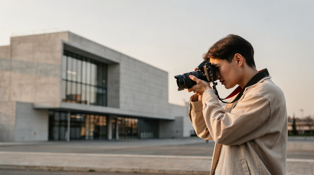
There’s a particular stillness that settles over a room when you’re working with film. The tripod clicks into place, the light meter gives its quiet reading, and suddenly you’re not just documenting a building — you’re waiting for it to reveal something. Digital can rush that process. Film won’t let you. When I’m standing in a 19th-century townhouse with a roll of Portra loaded and the afternoon light sliding across worn floorboards, every frame has to earn its place on the roll. That constraint isn’t a limitation. It’s what makes the final image feel like a memory rather than a record.
What draws me to photographing architecture on film isn’t the nostalgia or the aesthetic alone. It’s the way grain settles into plaster, how shadow roll-off softens a corner where two walls meet, how an emulsion interprets stone and wood with a density that feels tactile rather than clinical. A digital sensor can capture every detail perfectly and still miss the weight of a space. Film, with its imperfect but intentional rendering, translates the experience of moving through a building — the way light pools on a staircase landing, the texture of old glass in a window sash, the particular warmth of a room that’s been lived in for a century.
Why Architecture and Film Work So Well Together
Architectural photography often gets treated as pure documentation: straight lines, correct exposure, everything sharp. But buildings aren’t just geometry. They hold light, absorb sound, carry the marks of weather and use. Film is uniquely suited to capturing that because it records surfaces with a softness and density that digital sharpening can’t replicate. Plaster doesn’t look like a uniform white plane on film — it shows its trowel marks, its hairline cracks, the way it’s yellowed slightly near the ceiling. Wood grain reads with depth rather than as a texture overlay. Old glass reveals its imperfections instead of being rendered as a flat transparent sheet.
This matters most in spaces with history. I’ve photographed enough historic townhouses to know that a technically perfect digital file can make a 150-year-old room look like a sterile staging. The sensor sees everything equally, without discrimination. Film discriminates. It lets shadows fall away into darkness rather than lifting them artificially. It handles highlights with a gradual roll-off that preserves the feeling of bright window light without clipping to pure white. The grain structure, especially in medium format, adds a subtle texture that our brains read as organic and real. The result isn’t a stylized vintage look — it’s a more honest translation of how the space actually feels when you’re standing in it.
Then there’s the pace. When you’re shooting film, you don’t fire off twenty variations of the same composition. You study the room. You watch how the light moves. You notice the way a doorframe aligns with a window mullion, or how a particular angle makes a hallway feel longer and more inviting. That slower, more deliberate approach almost always produces stronger framing, cleaner lines, and fewer wasted frames. The building gets the attention it deserves, and the images are better for it.
The Core Approach I Use on Assignments
My process is built around three priorities that guide every decision on a shoot:
- Respect the architecture first.
- Use light that already belongs to the space.
- Let the film stock support the materiality of the building, not overpower it.
That sounds straightforward, but it affects everything: which lens I reach for, how I meter, what time of day I schedule the shoot, and whether the final image should feel restrained or lush. The building leads. I’m just there to listen.
1. Start with the building, not the camera
Before I even unzip the camera bag, I walk the space. Not with a photographer’s eye yet — just paying attention to what the structure is doing visually. Where does the strongest natural light enter? Which materials catch light and which absorb it? Are there reflective surfaces — polished floors, glass cabinet doors, mirrors — that will blow out highlights if I’m not careful? What’s the “story wall” or “hero angle” of the room — the view that makes you stop and take a breath?
This is the fastest way to avoid generic architectural images. The camera should serve the building’s strongest lines, proportions, and textures, not flatten them into a standard real-estate view. I’ve walked into rooms where the obvious shot was straight-on from the doorway, but the real image was from the corner, where the light raked across a plaster wall and revealed every undulation in the surface. You only find that by looking first, shooting second.
2. Choose the time of day carefully
Soft daylight is usually the safest choice for interiors and façades because it keeps shadows controlled and preserves detail in both bright and dark areas. Direct sun can work beautifully, but only when it’s doing something useful — drawing shape across a stairwell, emphasizing the depth of a window reveal, or casting geometric shadows that add structure to the composition. Harsh midday sun hitting a white wall at the wrong angle just creates problems.
For exteriors, early morning and late afternoon are often the most forgiving. The light has direction and warmth without the punishing contrast of noon. For interiors, I prefer the hours when window light is directional but not harsh — usually mid-morning or late afternoon, depending on the building’s orientation. Overcast days can be excellent because the clouds behave like a giant diffuser, wrapping light evenly around architectural details and letting textures speak without dramatic shadow interference.
3. Meter for the walls, not the windows
One of the biggest mistakes I see in interior architecture photography is metering for the brightest area — usually the windows — and hoping the room will sort itself out later. It won’t. The window may look properly exposed, but the room will fall into darkness, and no amount of scanning adjustment can recover detail that was never on the negative.
A more reliable method is to meter the walls or mid-tones in the room and then decide how much highlight protection you want. I typically use an incident meter for ambient readings or a spot meter on a neutral wall surface. This approach is especially helpful when the contrast between the interior and the window view is wide — which it almost always is in older buildings with small windows and deep rooms. Once I have a solid reading for the room itself, I can make a conscious choice about whether to let the windows blow out slightly for atmosphere or to bracket and blend later.
My Practical Film Stock Choices
Film stock changes how architecture feels. The same room photographed on Ektar versus Portra versus black and white will read completely differently — crisp and vivid, warm and restrained, or stripped down to form and texture. Choosing the right stock is as important as choosing the right lens.
| Film stock | Best use | Strengths | Watch out for |
|---|---|---|---|
| Ektar 100 | Bright exteriors, detailed façades | Fine grain, very sharp, vivid color | Can feel too saturated in warm interiors |
| Portra 160 | Soft interiors, gentle daylight | Smooth color, restrained contrast | Less forgiving in very dim spaces |
| Portra 400 | Mixed light, interiors with windows | Flexible, reliable in changing light | Needs careful scanning to keep color natural |
| Black and white film | Texture studies, historic spaces, material details | Strong separation, timeless feel | Easy to lose subtle color relationships |
When I use Ektar 100
Ektar is my choice when precision matters. It excels on façades, decorative masonry, window details, and daylight exteriors where the goal is definition and rich but controlled color. The fine grain and sharpness are remarkable — brickwork reads with almost tactile clarity, and painted trim holds its edges beautifully. But Ektar is less forgiving in heavy shade or mixed indoor light. Its saturation can push warm wood interiors toward orange, and it doesn’t handle underexposure gracefully. I use it when the scene is already clean, evenly lit, and asking for clarity rather than atmosphere.
When I use Portra 160 or 400
Portra is the safest choice for interiors because it handles mixed light better than almost anything else and keeps skin tones, paint, wood, and fabric looking natural. Portra 160 is lovely in stable daylight interiors — rooms with consistent window light and no sudden shifts in color temperature. The finer grain and slightly lower contrast give it an elegant, restrained feel that suits period interiors particularly well. Portra 400 is what I reach for when I need flexibility, especially if the room has deep shadows or I expect longer exposures. Its wider latitude means I can protect highlights without losing shadow detail, and it handles the color shifts from mixed daylight and tungsten with more grace than most stocks.
When black and white makes sense
Black and white isn’t just for mood. It’s a practical choice when color is distracting from form, shadow, or structure. Historic staircases, old industrial rooms, and minimalist interiors often benefit from stripping away color because the frame becomes about line and texture. A wrought-iron railing against a curved plaster wall reads differently in black and white — the relationship between the materials takes center stage without the complication of color temperature or saturation. I often load a roll of Ilford HP5 or Delta when I know the building’s strength is in its bones rather than its palette.
Exposure Settings That Actually Work
For interior architecture, I almost always work from a tripod and keep the aperture around f/8 to f/11 for depth of field. That range keeps foreground details and far walls reasonably sharp without forcing the exposure into extremes or introducing diffraction softness at smaller apertures.
A practical starting setup looks like this:
- Film: Portra 400
- Aperture: f/8 or f/11
- Shutter speed: 1–4 seconds
- Support: Tripod
- Metering: Incident meter or spot meter on walls
Why long exposures are normal indoors
Rooms are often much darker than they appear to our eyes. What feels like a bright, airy space can easily require a two-second exposure at f/8 on 400-speed film. Long shutter speeds aren’t a problem if the camera is stable and nothing in the frame is moving. In fact, longer exposures can help architecture feel calm and deliberate — the stillness of the space translates into the image.
What to watch for:
- People walking through the frame — even a partial figure can ruin a shot
- Curtains moving near open windows — subtle but noticeable in a long exposure
- Street traffic outside windows — cars and pedestrians create distracting blurs
- Small vibrations from floors or doors — old buildings transmit movement surprisingly well
If you’re shooting a lived-in property, ask everyone to step out of frame during the exposure. Even someone standing still in another room can create floor vibrations that soften the image.
Composition: How I Keep Architecture from Looking Generic
Good architectural composition is mostly subtraction. Remove clutter, awkward angles, and unnecessary perspective distortion until the structure reads clearly. The building should be the subject, not the furniture, not the styling, not the photographer’s cleverness.
My composition checklist
- Keep verticals straight unless you have a reason not to — converging lines should be intentional, not accidental.
- Use leading lines, but don’t force them — a hallway naturally draws the eye; you don’t need to exaggerate it.
- Include enough context to show how the room is used — a chair by a window tells a different story than an empty corner.
- Avoid cutting through important architectural elements — don’t slice a fireplace mantel or a doorframe in half.
- Watch edges carefully; distracting objects often live there — the edge of a lampshade, a sliver of a rug, a power outlet.
Traditional architectural work often relies on camera movements or tilt-shift control to manage perspective. On film, this matters even more because corrections in post are limited compared with digital workflows. If you’re using a 35mm film camera, a tilt-shift lens can help preserve straight walls and reduce the feeling that the building is falling backward. With medium format, I’m even more careful about camera position because the larger negative captures every degree of tilt.
Interior Photography: The Hardest Part of the Job
Interiors are where film becomes most demanding and most rewarding. You’re balancing window light, artificial fixtures, reflective surfaces, and material texture all at once. A single room can have three different color temperatures, glossy floors that create hotspots, and a window that’s four stops brighter than the darkest corner. Getting it right requires managing all of those variables simultaneously — and film doesn’t give you an LCD screen to check your work.
Common interior challenges
- Mixed color temperatures from lamps and daylight — tungsten bulbs, LED fixtures, and window light all read differently on film.
- Bright windows with deep room shadows — the dynamic range can easily exceed what the film can handle.
- Glossy surfaces that create hotspots — polished floors, glass tabletops, and lacquered furniture reflect light unpredictably.
- Tight spaces that make camera placement difficult — small rooms, narrow hallways, and awkward corners limit tripod positions.
- Limited time in occupied homes — you can’t always wait for the perfect light or rearrange the furniture.
How I handle mixed light
If the room has both daylight and tungsten sources, I decide early whether the image should feel warm, neutral, or slightly cool. Trying to force every color source into perfect neutrality usually makes the file feel dead — the room loses its character. It’s often better to keep the space honest and let one light source dominate. A living room lit primarily by window light with a single warm lamp in the corner feels natural. The same room with every bulb color-corrected feels sterile.
In practice, that means:
- Turning off unnecessary lamps that add competing color temperatures without contributing to the room’s character.
- Leaving on fixtures that belong to the space — a pendant light over a dining table, a sconce in a hallway.
- Shooting during the part of the day when daylight is more stable — avoiding the rapid changes of early morning or late dusk.
- Choosing film stock that won’t exaggerate color shifts — Portra’s color palette is more forgiving than Ektar’s in mixed light.
Exterior Photography: Use Weather as a Tool
Exterior architecture is easier in one sense — you have more light — and harder in another — you have far more variables. Clouds, reflections, harsh sun, and wind all change the image quickly. A façade that looks flat and uninteresting at noon can be stunning at dusk with interior lights glowing through the windows.
Best conditions for exteriors
- Overcast skies for even tonal balance — the soft light wraps around details without casting harsh shadows.
- Early or late daylight for dimensional shadows — low-angle sun reveals texture in stone, brick, and wood.
- Light rain or post-rain conditions for richer surfaces — wet stone and brick deepen in color and reflect more light.
- Blue hour for glowing interiors and strong silhouette — the brief window after sunset when the sky is deep blue and interior lights are visible.
For documentation, overcast is often the most practical because it reduces contrast and helps the façade read evenly. Every detail, from cornice moldings to window mullions, gets equal treatment. For atmosphere, low sun can be beautiful when it reveals texture in materials — the way brick catches light on its rough edges, how stone carvings cast small shadows that define their depth. I’ve shot the same building under both conditions and ended up with completely different stories.
My Step-by-Step Workflow on a Film Architecture Shoot
Over years of shooting, I’ve developed a workflow that keeps me organized and helps me avoid the mistakes that waste film and time. It starts before I ever leave the house.
Before the shoot
- Visit or study the site plan if available — knowing the building’s orientation and layout helps predict light.
- Identify the strongest exterior and interior angles — sometimes from reference photos, sometimes from architectural drawings.
- Check the sun path and available daylight — apps can show you exactly where the sun will be at any time of day.
- Decide which film stocks suit the materials — warm wood interiors get different treatment than white minimalist spaces.
- Pack tripod, meter, cable release, and spare batteries — nothing derails a shoot faster than a dead light meter.
On location
- Walk the space slowly before unloading gear — let the building tell you where to set up.
- Set the tripod only after finding the best viewpoint — committing to a position too early limits your options.
- Meter highlights and mid-tones before exposing — know what you’re protecting and what you’re letting go.
- Review composition for edges, clutter, and verticals — the viewfinder is small; scan every edge deliberately.
- Bracket only when contrast is genuinely difficult — don’t waste frames on scenes that a single careful exposure can handle.
After the shoot
- Label rolls immediately — location, date, stock, and any special instructions for the lab.
- Note stock, exposure intent, and any lighting issues — memory fades; notes don’t.
- Keep a short log of what worked and what failed — this becomes invaluable for future shoots.
- Compare scans carefully against your field notes — did the film capture what you intended?
The Errors I See Most Often
1. Overcorrecting the space
Trying to make every room look perfectly symmetrical can strip away character. Some buildings feel stronger when the composition acknowledges how they’re actually built and used — a slightly off-center doorway, a window that isn’t perfectly aligned with the wall. Architecture is made by humans, and those imperfections are part of the story.
2. Ignoring highlight control
Windows are the most common failure point in interior architecture. If you don’t protect them, you lose the detail that anchors the room to the outside world. A blown-out window isn’t just a technical flaw — it removes the connection between interior and exterior that makes a room feel like part of a larger place.
3. Choosing the wrong film stock for the light
A stock that looks beautiful in one room may be wrong in another. Bright, clean exteriors and dim, mixed-light interiors need different emulsions. Ektar in a dark wood-paneled library will struggle; Portra 400 on a bright white façade is overkill. Match the stock to the conditions, not to your habits.
4. Underestimating tripods and stability
On film, especially in interiors, handheld work is usually a compromise. If the goal is polished architectural work, stability matters more than speed. A cheap tripod on an uneven floor can introduce micro-vibrations that soften the entire image. Invest in solid support and use a cable release.
5. Treating the scan like an afterthought
Scanning is part of the final image. Poor scans can flatten the tonal quality that made film worthwhile in the first place. A good scan preserves the shadow detail, the highlight roll-off, and the color relationships that the negative captured. Don’t let a careless scan undo careful exposure.
A Simple Decision Guide
| Situation | Best starting choice |
|---|---|
| Bright exterior with strong detail | Ektar 100 |
| Warm interior with daylight | Portra 160 |
| Interior with changing light | Portra 400 |
| Historic room with strong texture | Black and white film |
| Tight space with perspective concerns | Tilt-shift lens or careful camera placement |
Checklist for a Strong Architecture-on-Film Frame
- The verticals are controlled.
- The light is doing something useful.
- The chosen film stock matches the space.
- The composition shows structure without clutter.
- The exposure preserves both texture and detail.
- The frame feels like the room, not just a picture of it.
Final Thoughts
Photographing architecture on film is less about chasing perfection and more about translating space honestly. The grain, the tonal transitions, the way an emulsion responds to light — these aren’t imperfections to be corrected. They’re the tools that let a photograph carry the weight and atmosphere of a real place. Film rewards attention to material, time, and atmosphere in a way that digital often struggles to replicate, not because digital is inferior, but because film’s constraints force a different kind of seeing.
If you approach each assignment with careful metering, thoughtful stock selection, and respect for the existing light, the building will give you more than a record. It will give you a story — one that feels lived-in, remembered, and true to the space itself.
FAQ
What film stock is best for architecture photography?
Portra 400 is the most versatile starting point for interiors — it handles mixed light gracefully and has enough latitude to protect highlights and shadows. For sharp, colorful exteriors, Ektar 100 is excellent, delivering fine grain and vivid but controlled color.
Do I need a tripod for interior architecture on film?
Yes. A tripod is effectively essential for interior work because shutter speeds are often in the 1–4 second range. Even in brighter rooms, the depth of field required for architectural work usually demands apertures that make handheld shooting impractical.
How do I keep windows from blowing out?
Meter the room, not just the windows, and decide in advance how much highlight detail you want to preserve. I typically meter the walls or mid-tones and then check the window exposure separately. Bracketing can help when contrast is extreme, but a single careful exposure based on the room’s mid-tones often produces a more natural result.
Is black and white good for architectural photography?
Yes, especially when the goal is to emphasize form, texture, and shadow rather than color. Historic staircases, industrial spaces, and minimalist interiors often read more strongly in black and white because the image becomes about structure and material rather than palette.
Can I photograph architecture on 35mm film?
Yes. A 35mm camera can work well, especially with a careful lens choice and strong composition. The smaller negative means grain is more pronounced and fine detail is less resolved than with medium format, but that can be an aesthetic choice rather than a limitation. Some of my favorite architectural images were made on 35mm with a 28mm lens and a tripod.