The Film Stocks I Use Most Often
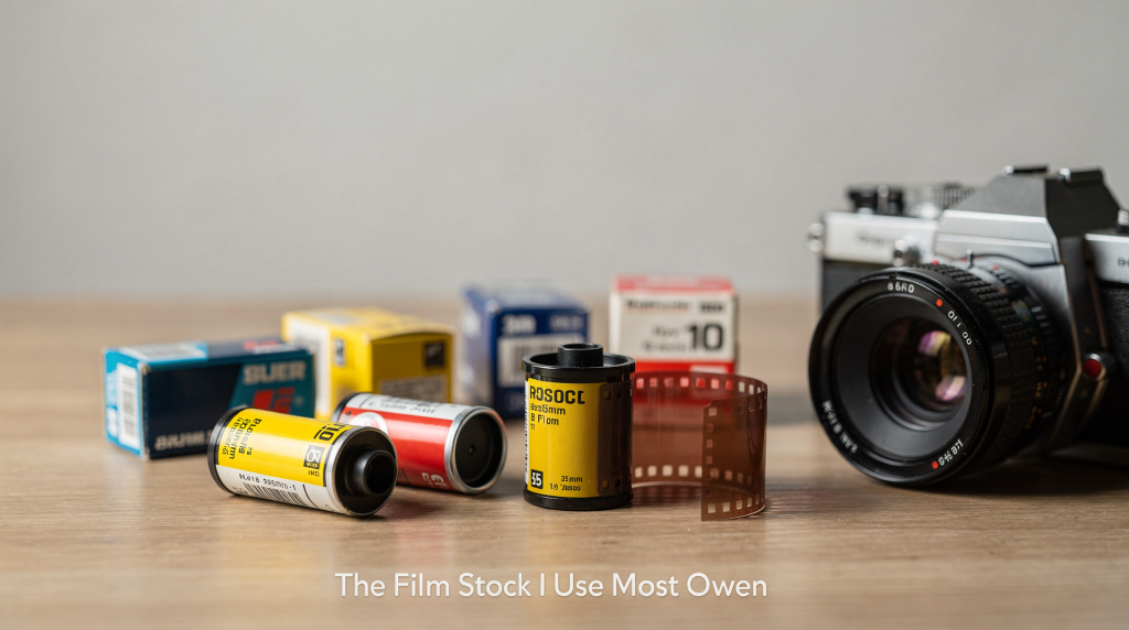
When I’m photographing interiors and buildings on film, the stock matters as much as the lens. The right emulsion can protect highlights, keep mixed light believable, and preserve the textures that make a space feel lived-in rather than merely documented. A digital sensor might record every detail with clinical precision, but film translates — it gives you grain in the shadows, a particular curve in the midtones, and a way of holding window light that feels less like data and more like memory.
Why film stock choice matters in architectural work
Architecture is unforgiving. White walls can blow out fast, shadow detail disappears under stairwells, and mixed lighting from windows, tungsten lamps, and daylight can make a room look chaotic if the film cannot handle it well. I’ve walked into sun-filled parlours where the light bouncing off polished floors was so bright that a lesser stock would have surrendered the highlights entirely. In those moments, you learn to choose your emulsion the way a carpenter chooses wood — not for how it looks on the shelf, but for how it behaves under stress.
For that reason, I choose stocks based on three things:
- how much exposure latitude they give me
- how they handle contrast in real spaces
- whether the grain or colour palette supports the mood of the property
For interior work, a versatile ISO 400 film is often the safest starting point because it gives enough speed for slower shutter work while remaining flexible in changing light. Portra 400 is commonly used for this kind of mixed-light interior work because it handles a wide range of lighting conditions with generous latitude. For black-and-white work, HP5 Plus is widely described as a medium-contrast ISO 400 film suited to available-light shooting, including indoor work. Both have earned their place in my bag not through marketing, but through hundreds of rolls where they simply delivered.
My most-used film stocks
Kodak Portra 400
Portra 400 is the stock I reach for most often when colour matters and the space has complicated lighting. It is a C-41 colour negative film with ISO 400 speed and a wide exposure latitude, which makes it forgiving in rooms where daylight, lamps, and shadows all compete at once. That forgiveness is exactly what you want in interiors, because it helps hold detail in both bright windows and darker corners. I’ve exposed it at box speed in a room lit only by a north-facing window and a single tungsten lamp, and the scan came back with the window retaining the view outside and the lamp’s warmth still reading as intentional, not as a colour cast disaster.
Why it works for architecture
- It keeps tones natural rather than overly punchy
- It tolerates mixed light better than many consumer colour films
- It gives enough flexibility for tripod-based interior exposures
What I appreciate most is how it handles the subtle transitions on a lime-washed wall or the way aged wood shifts from honey to shadow. There’s no artificial saturation spike — just an honest, almost quiet rendering that lets the space speak.
Where it falls short
- It is not the best choice if you want highly saturated, graphic colour
- It can look too restrained for bold exterior facade work in dramatic weather
- It may feel “too clean” if you want a more editorial or gritty mood
If I’m shooting a modernist concrete structure under storm clouds, Portra 400’s politeness can feel like a missed opportunity. Sometimes you need the emulsion to add its own character, not just step politely aside.
Best uses
- historic interiors
- residential commissions
- soft daylight rooms
- properties where accurate tone is more important than strong colour contrast
Ilford HP5 Plus
HP5 Plus is my default black-and-white film for architecture and interiors. It is a high-speed, medium-contrast black-and-white negative film rated at ISO 400, and it is specifically described as suitable for available-light and indoor photography. That combination makes it very practical in dim hallways, older homes, or buildings where I want to work quickly without forcing the scene into a polished colour palette. There’s a particular thrill in loading a roll of HP5 before stepping into a dusty attic or a cellar with one bare bulb — you know the film will find the shape of things even when your eyes are still adjusting.
Why it works for architecture
- It holds shape and structure well in shadowed rooms
- It gives a classic documentary feel without becoming harsh too quickly
- It can be pushed when light is limited, which adds flexibility on assignment
I’ve pushed HP5 to 1600 in a row of Georgian townhouses where the only light came from narrow stairwell windows, and the resulting grain felt like part of the building’s own texture — not noise, but a kind of visual patina that matched the worn banisters and uneven plaster.
Best uses
- historic properties
- textured interiors
- exteriors with strong graphic lines
- projects where form matters more than colour
Watch-outs
- It can flatten subtle tonal separation if overdeveloped
- In flat light, it may need careful metering to avoid muddy midtones
- If the client expects realistic colour, it is obviously the wrong choice
How I decide between colour and black-and-white
The decision is less about style and more about the story the space needs to tell. I’ll walk through a property and ask myself: is the narrative in the faded wallpaper and the way the light catches dust motes, or is it in the bones of the room — the proportions, the shadows, the weight of the ceiling? Colour can distract from a perfect line; black and white can flatten the warmth of aged timber. The table below maps out my typical thought process on location.
| Situation | Best choice | Why |
|---|---|---|
| Warm residential interior with natural light | Portra 400 | Preserves believable colour and soft tonal transitions |
| Dim historic rooms with low light | HP5 Plus | Better suited to available-light work and push processing |
| Interior with mixed tungsten and daylight | Portra 400 | Handles mixed lighting more gracefully |
| Strong architectural form, minimal decor | HP5 Plus | Emphasises line, contrast, and texture |
| Client wants a polished, contemporary look | Portra 400 | Keeps surfaces and finishes looking natural |
| Client wants a timeless editorial feel | HP5 Plus | Creates a more interpretive, archival feel |
My practical loading strategy
I do not treat film stock as an abstract preference. I match it to the assignment. Before I even open the camera back, I’ve already run through the light, the materials, and the final intention for the images. A roll of film is a commitment — you’re choosing a visual language for the next 12 or 36 frames, and you can’t change it mid-roll without losing coherence.
Before the shoot
- I check whether the space is primarily daylit, tungsten-lit, or mixed
- I decide whether the story depends on colour or structure
- I consider how much tripod time I will have in each room
- I note whether windows, mirrors, or glossy finishes will make highlights difficult
On location
- I rate Portra 400 at box speed unless the light is unusually tricky
- I meter carefully for windows so I do not lose exterior detail
- I use HP5 Plus when I want shadow texture and a more graphic reading of the room
- I stay consistent within a series so the final edit feels coherent
There’s a rhythm to it: I’ll often load the same stock for an entire floor of a house, then switch only when the light character fundamentally changes — say, moving from a sun-drenched conservatory to a windowless basement kitchen. That consistency lets the images breathe together as a set.
Common mistakes when choosing film for interiors
1. Choosing a stock for aesthetic reasons only
A film can look beautiful in isolation and still fail in a specific room. A highly saturated stock may be wrong for a quiet historic interior, while a contrasty black-and-white film may be too aggressive for a refined residential commission. I’ve seen photographers fall in love with a film’s lookbook and then wonder why their pastel-coloured bedroom feels like a candy store. The room always gets the final vote.
2. Ignoring mixed light
Mixed lighting is one of the biggest problems in interior work. A stock with good latitude gives you more room to balance window light, lamp light, and reflected colour without the frame falling apart. When I’m in a room lit by both a cool north window and a warm table lamp, I know Portra 400 will let those two temperatures coexist without one turning the other into a colour cast nightmare. A less forgiving film would force me to gel windows or correct in post — and that’s not why I shoot film.
3. Underestimating grain
Grain is not just a technical issue; it changes the emotional tone of the image. HP5 Plus gives a classic documentary grain structure, while Portra 400 usually feels smoother and more subdued. In a weathered farmhouse, the grain of pushed HP5 can feel like part of the story — it echoes the rough-hewn beams and peeling paint. In a sleek penthouse, that same grain might read as a mistake. You have to listen to what the space is asking for.
4. Using the same stock for every space
A sunlit apartment, a dark Georgian hallway, and a modern kitchen do not ask for the same solution. The best results usually come from matching the film to the material language of the building. I’ve made the mistake of bringing only one stock to a location shoot and regretting it the moment I stepped from a bright, airy living room into a panelled library lit by a single sconce. Now I always carry at least two options, even if I only end up using one.
A simple stock-selection workflow
Step 1: Define the job
Ask what matters most:
- colour accuracy
- tonal separation
- atmosphere
- documentary clarity
Step 2: Read the room
Look at:
- window direction
- practical lights
- wall colour
- reflective surfaces
- depth of shadow
Step 3: Choose the stock
- Use Portra 400 when colour and flexibility matter most
- Use HP5 Plus when structure, mood, and available light matter most
Step 4: Expose with restraint
In interiors, protecting highlights usually matters more than forcing every shadow open. Film is forgiving, but not magic. I’ll often meter for the brightest part of the scene that I want to retain detail in — a window, a white wall in direct sun — and let the shadows fall where they may. That approach keeps the image feeling natural rather than artificially lifted.
My short list for different kinds of spaces
- Period homes: Portra 400 for colour, HP5 Plus for a more archival look
- Modern interiors: Portra 400 for clean, balanced colour
- Shadowy stairwells and corridors: HP5 Plus for depth and texture
- Editorial architectural projects: HP5 Plus when line and form lead
- Client-facing residential work: Portra 400 when natural colour is the priority
Checklist before you load the camera
- Decide whether the final image should feel descriptive or interpretive
- Check if the space contains mixed light
- Confirm whether the client wants colour
- Bring the stock that matches the room, not just your favourite look
- Keep one consistent film choice per set when possible
- Meter carefully around bright windows and reflective surfaces
The stock I keep returning to
If I had to reduce my working routine to two emulsions, it would be Kodak Portra 400 for colour and Ilford HP5 Plus for black and white. Portra gives me room to handle difficult interiors without losing natural tone, while HP5 Plus gives me a dependable, flexible black-and-white option for spaces where texture and structure should lead. These aren’t the only films I use, but they’re the ones I trust when the light is uncooperative, the schedule is tight, and the building deserves more than a quick snapshot. They’ve become less like tools and more like collaborators — each with its own voice, its own way of remembering a place.
FAQ
What is the best film stock for interior photography?
For most interior work, Portra 400 is a strong colour choice because of its latitude and mixed-light handling, while HP5 Plus is a reliable black-and-white choice for available-light interiors. The “best” always depends on the specific room and the story you’re telling, but these two cover the vast majority of architectural situations I encounter.
Is ISO 400 good for architecture photography?
Yes. ISO 400 is often a practical sweet spot for interiors because it balances speed and flexibility, especially when working on a tripod or in available light. It’s fast enough to hand-hold in brighter rooms, yet fine-grained enough to hold detail in a large print.
Should I shoot architecture on colour or black and white film?
Choose colour when materials, paint, and light temperature are important. Choose black and white when form, shadow, and structure are the point of the image. Sometimes I’ll shoot both on the same project — colour for the real estate listing, black and white for my own archive — because they tell different truths about the same space.
Can HP5 Plus be pushed for low-light interiors?
Yes. HP5 Plus is known for responding well to push processing and can be rated up to EI 3200/36°, which makes it useful in darker spaces. I’ve pushed it to 1600 and 3200 in candlelit chapels and unlit basements, and the grain becomes part of the atmosphere rather than a flaw.
Why not use a faster film all the time?
Faster films can help in low light, but many architectural interiors benefit from the balance, grain, and tonal control of ISO 400 stocks rather than pushing speed alone. A 3200-speed film might get you a shutter speed you can hand-hold, but it can also bring grain that overwhelms delicate textures and reduces the subtle tonal separation that makes an interior feel spacious.
Conclusion
The film stocks I use most often are not chosen for novelty. They are chosen because they solve real problems in real spaces. Portra 400 gives me dependable colour and latitude for mixed-light interiors, while HP5 Plus gives me a flexible black-and-white option that handles available light with confidence. In architectural photography, that reliability matters more than chasing a one-size-fits-all look. A building has its own voice; the film is simply how I listen.